Aesthetic Website Design for Coaches: Why Luxury Brands Convert Better
Jun 17, 2026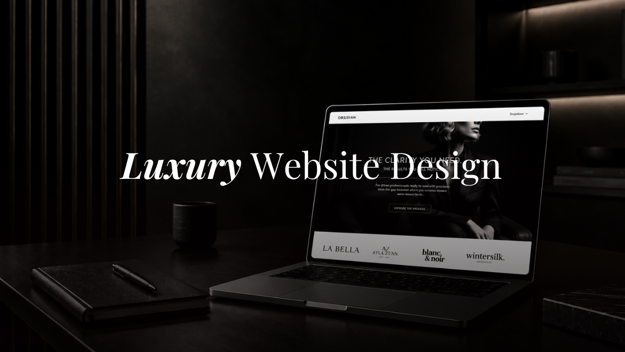
Most coaching websites look like they were designed by someone who Googled "clean and professional" and stopped there. Soft neutrals, a script font, a hero image of a woman looking thoughtfully out a window. It's safe. It's forgettable. And if you're trying to attract high-paying clients, it's costing you.
Your website isn't just a place to list your services. It's the first experience a potential client has of your brand — and that experience tells them, instantly, whether you're someone worth investing in.
Why Most Coaching Websites Look the Same
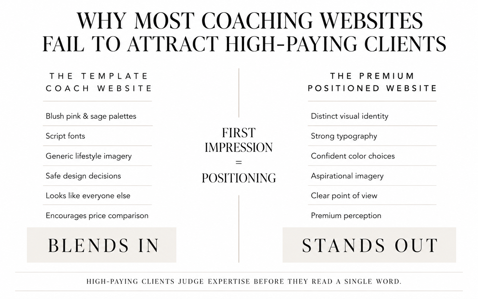
There's a template problem in the coaching industry, and I don't mean that literally. The issue is that most coaches are designing their websites by looking at what other coaches are doing — and what other coaches are doing is following a trend that peaked several years ago.
Blush pink. Sage green. Warm beige. Lots of white space. A lowercase logo. A font that says "soft and approachable."
These choices aren't wrong exactly, but they've become so common that they no longer communicate anything distinctive. When your website looks like every other coach in your niche, you're not standing out — you're blending in with the people your ideal clients are comparing you to.
High-paying clients aren't just buying a coaching package. They're making a judgment call about who you are, what you stand for, and whether your level of expertise matches the investment they're about to make. A muted, forgettable website doesn't make that case.
What "Aesthetic" Actually Means in Website Design
The word "aesthetic" gets used loosely, so it's worth being specific about what it means in the context of a coaching website.
An aesthetic website isn't just one that looks pretty. It's one where every visual decision — color, typography, layout, imagery, spacing — works together intentionally to create a specific feeling. The design has a point of view. It says something about who you are before a single word is read.
That's what separates a website that gets compliments from a website that gets clients. One looks nice. The other communicates authority, taste, and confidence in a way that makes the right person think: "This is exactly who I've been looking for."
The Psychology Behind Luxury Branding (And Why It Works)
Think about the brands people pay a premium for. Not because the product is objectively ten times better, but because of how it makes them feel to own it.
A luxury car isn't just transportation. A designer handbag isn't just a bag. People pay for the identity attached to the purchase — the confidence, the status, the feeling of being someone who invests in the best.
The same psychology applies to high-ticket coaching. Your clients aren't just buying access to your knowledge. They're buying into a vision of who they're becoming. And your brand needs to reflect that vision back to them before they even read your bio.
When your website looks premium, aspirational, and considered, you attract people who are ready to invest at that level. When it looks like everyone else's, you attract people who are still comparison shopping on price.
Minimal vs Luxury: Understanding the Difference
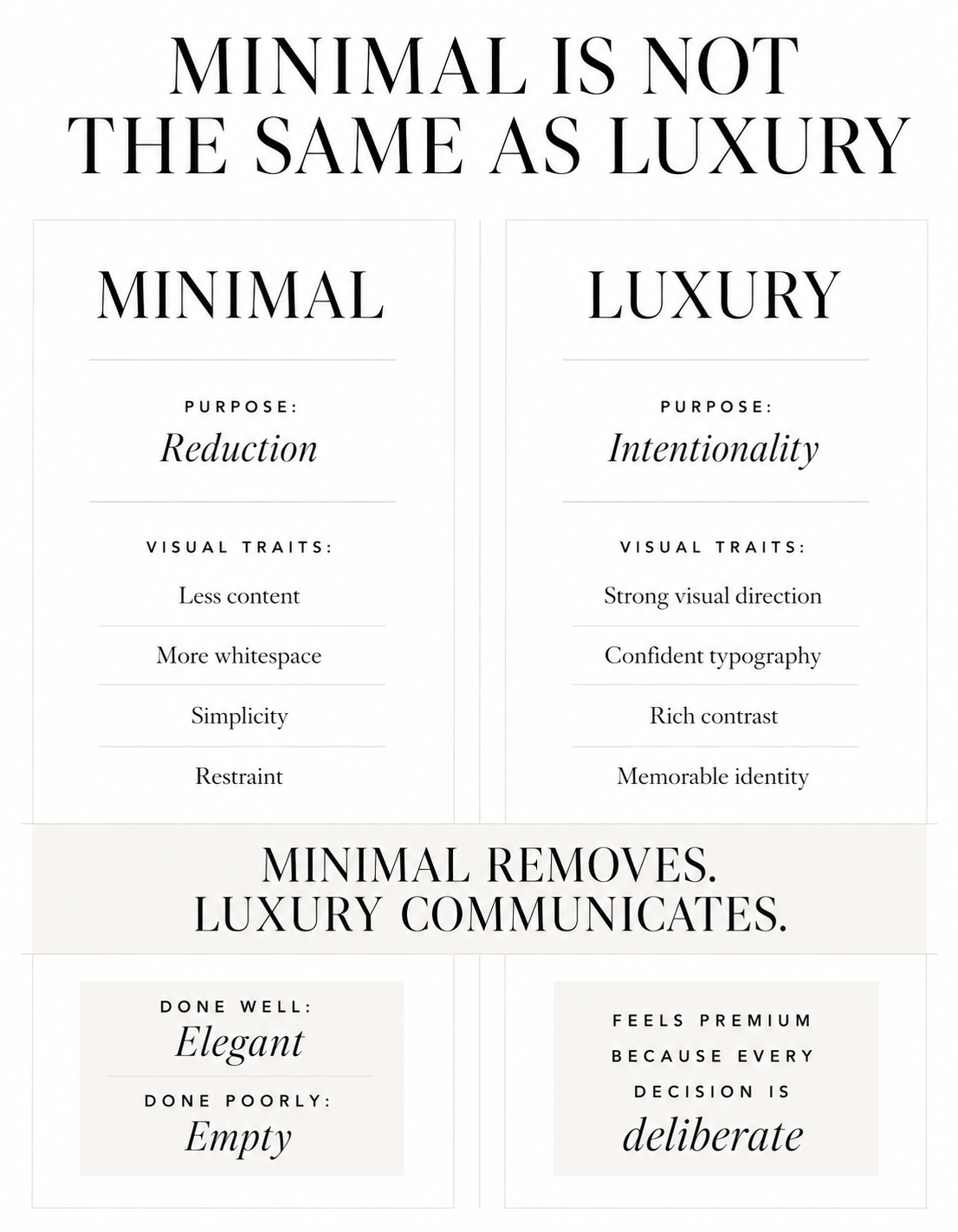
Minimal and luxury are not the same thing, even though they're often conflated.
Minimalism is about reduction. Strip everything back, keep only what's necessary, let white space do the work. Done well, it's elegant. Done lazily, it's empty.
Luxury is about intentionality and confidence. It can include restraint, but it's never timid. Luxury brands use deep, rich tones. Strong typography. Considered contrast. They take up space rather than shrinking from it.
The coaches who attract the highest-paying clients tend to have websites that feel like walking into a well-designed space — there's a clear aesthetic direction, nothing feels accidental, and the overall impression is one of someone who knows exactly what they're doing.
Pastels and lowercase fonts can work beautifully in the right context. But if your packages start at $5,000 and your website looks like a mood board from 2019, there's a disconnect — and your potential clients will feel it even if they can't name it.
Learn more about the best website templates for coaches.
What High-Paying Clients Are Really Buying
This is the part most coaches miss.
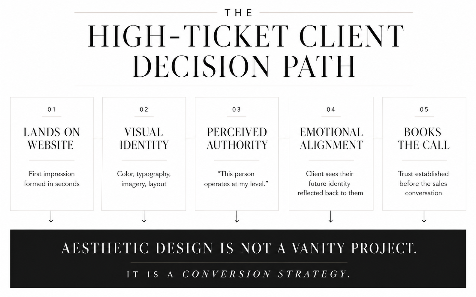
High-ticket clients are not buying a to-do list or a framework. They're buying transformation, and more specifically, they're buying the version of themselves that exists on the other side of working with you.
Your website is where that sale begins. Before the discovery call. Before the testimonials. Before they've read a single case study.
The moment someone lands on your site, they're asking themselves one question: "Is this person on my level?" If the answer feels like yes — if the design, the copy, and the overall experience feel aligned with where they want to be — they stay. They read. They book.
If the answer feels like no, they leave. Usually within seconds.
This is why aesthetic website design isn't a vanity project. It's a conversion strategy.
What a Luxury Coaching Website Actually Looks Like
There's no single formula, but there are patterns that show up consistently in high-converting, high-end coaching websites.
Strong visual identity. A clear color palette, used consistently. Typography that has personality and hierarchy. A brand that looks the same whether someone finds you on Instagram or lands on your homepage.
Bold, confident choices. Dark backgrounds with light text, or rich jewel tones, or high-contrast black and white. Not every luxury website is dark — but every luxury website has conviction.
Imagery that reflects the client's aspiration. Not stock photos of women at laptops. Images that feel elevated, intentional, and specific to the world your client wants to inhabit.
Copy and design working together. The words match the visual energy. A bold, premium design paired with hesitant, over-explanatory copy creates a disconnect. Both have to pull in the same direction.
A clear path to the next step. Luxury isn't just about looking beautiful. A high-end website is also built to convert — the hierarchy is clear, the CTA is obvious, and nothing gets in the way of the person who's ready to say yes.
How to Get an Aesthetic, High-End Website Without Starting From Scratch
Building a website from scratch is expensive, slow, and unless you're working with a designer who truly understands premium positioning, often disappointing.
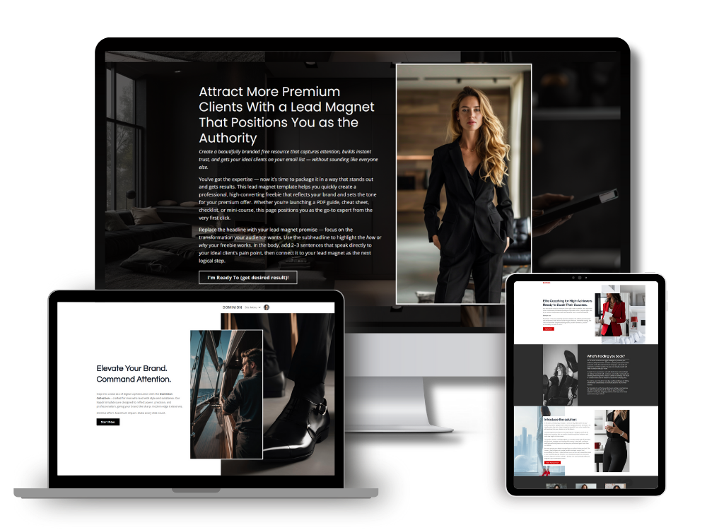
A well-designed Kajabi template gives you the structure, the aesthetic direction, and the layout logic of a high-end website — without the custom build price tag or the months-long timeline. The best templates aren't blank canvases. They're fully considered designs where the decisions have already been made: the typography pairings, the color relationships, the section hierarchy.
Your job is to bring your brand into a framework that was built to convert.
The right template won't just look good. It will feel like it was made for the version of your business you're building toward. Some coaches land on a design and know immediately. Others take a little longer to find the one that clicks.
Either way, the starting point is the same: go see what's there. Browse the Kajabi website template collections and pay attention to what stops you scrolling.
That reaction is usually worth listening to.
Simon
Keep learning: In my next article I'll share with you the difference between Luxury and Minimal websites and how they attract high ticket clients.
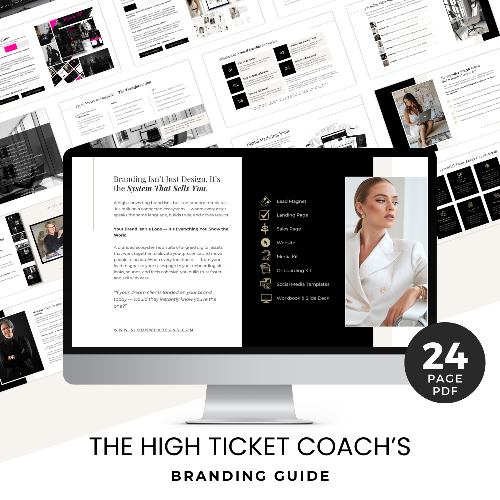
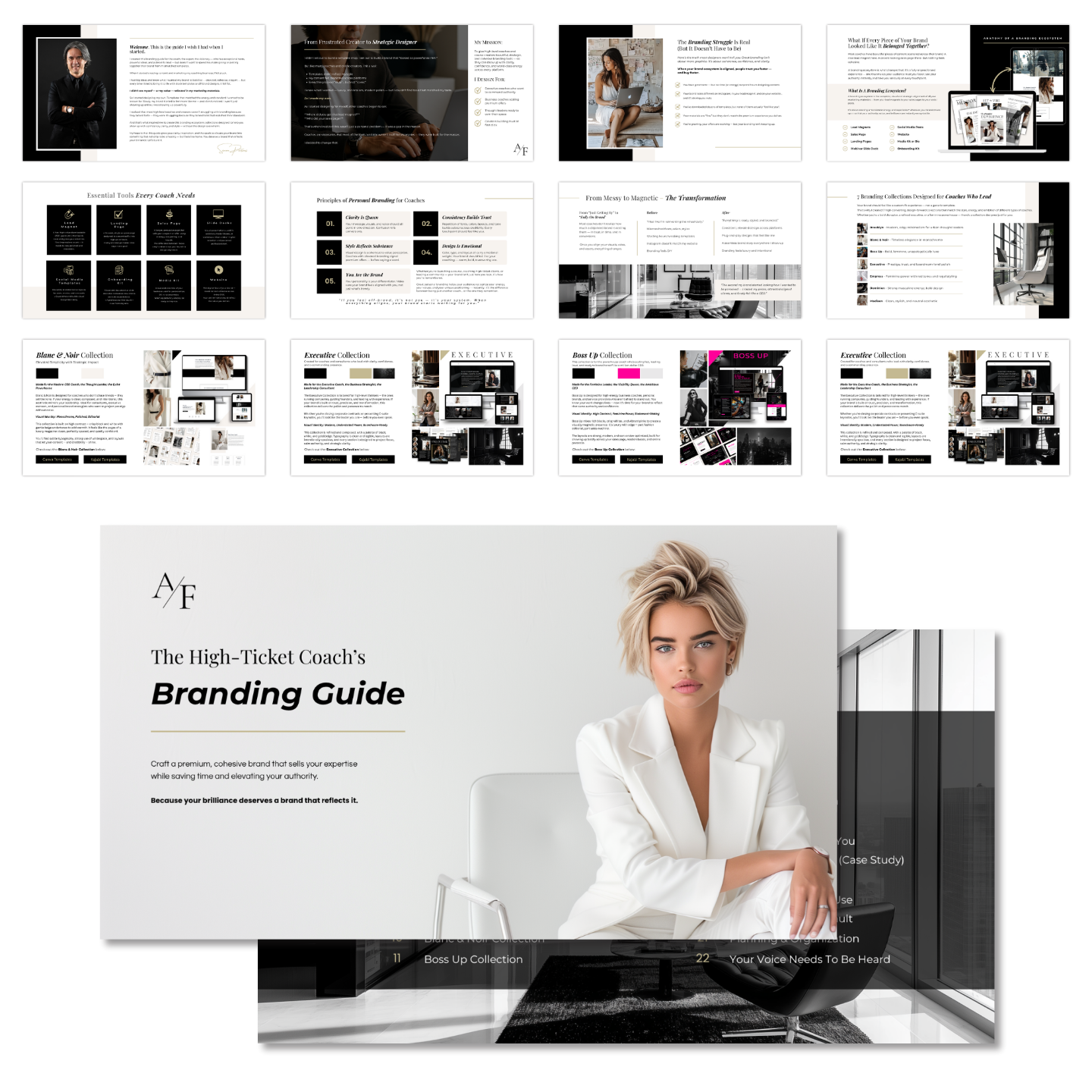
Grab my free High Ticket Coach Branding Guide
A free guide for coaches, consultants, and creators who are ready to ditch the DIY look and step into a cohesive, premium brand presence that sells.
We hate SPAM. We will never sell your information, for any reason.