What Your Website Design Says About Your Coaching Business
Jul 16, 2026
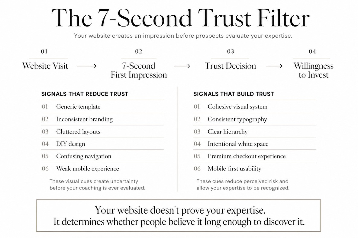
A potential client lands on your website and makes a decision about you in about seven seconds. Before she reads a single testimonial. Before she checks your credentials. Before she watches your intro video. Her nervous system has already registered whether you look like someone worth paying five figures to work with.
That's the part most coaches skip past. You can have a genuinely excellent program, real client results, and years of expertise, and still lose the sale because your website told her something different about who you are.
I've built Kajabi sites for coaches at every stage of this realization. The pattern is always the same. The coaching is strong. The website is quietly working against it.
Your website makes a decision before your client does
Think about the last time you landed on a website for a service you were considering paying real money for. A lawyer. A financial planner. A surgeon. You formed an opinion about their competence before you read a word of their bio, just from how the site looked and felt.
Your potential clients do the same thing to you. A high-ticket coaching offer asks someone to trust you with money, time, and often something personal, like their business or their health. Your website is the first evidence she gets. If it looks uncertain, she assumes you might be too.
This isn't shallow of her. It's efficient. She has no way to evaluate your actual coaching ability from a website. She can only evaluate the signals in front of her: the layout, the photography, the copy, how the pages flow into each other. Those signals become a stand-in for everything she can't yet verify about you.
What a generic template says, even if the coaching is excellent
A free or default Kajabi theme isn't neutral. It says something specific: this business hasn't invested in itself yet.
That reads as a signal to a prospective client, whether or not it's a fair one. If you haven't put resources into how your business presents itself, she quietly wonders what else might be underbuilt. Your intake process. Your systems. Your follow-through.
I've talked to coaches who resist upgrading their site because "the content matters more than the design." I agree the content matters more. But the design is what earns the right for anyone to read the content at all.
This shows up most clearly on the sales page and checkout page, the two pages doing the actual selling. A generic checkout page, in particular, is where a lot of coaches lose momentum right at the finish line. A prospect who was ready to buy hits a page that looks like it belongs to a different, less established business, and the hesitation creeps back in.
What inconsistent branding says
Mismatched fonts. A logo that doesn't match your color palette. Sales pages that look like they were built by three different people over three different years. This is one of the most common issues I see on coaching websites, and it's rarely intentional. It happens gradually, page by page, as a business grows.
Inconsistency reads as instability. Not because your business actually is unstable, but because the brain uses visual coherence as a shortcut for reliability. A site that looks like it was designed as one cohesive system tells a visitor that you run your business the same way: with intention, not improvisation.
I see this most often when a coach has grown quickly. She launched a new offer, added a new landing page, updated her headshots, and never went back to bring the older pages in line with the new direction. Each page is fine on its own. Together, they tell a visitor that this business is still figuring itself out, even when it isn't.
What clutter and DIY design say
Too many fonts. Too many colors. Stock photos that don't match your actual energy. Sections crammed with every offer you've ever created, all competing for attention on one page.
Clutter says one thing clearly: I'm not sure what I want you to do here. And if you're not sure, your visitor definitely isn't. Confusion doesn't convert. A client who has to work to figure out your offer, your price, or your next step will almost always leave instead of asking.
High-ticket buyers in particular are pattern-matching against other premium experiences they've paid for. A cluttered site doesn't just look unpolished. It looks like a mismatch for the price point you're asking her to pay.
What a premium, cohesive site says
Now flip it. A site with a clear visual hierarchy, a consistent palette, intentional white space, and copy that speaks directly to one person, says something completely different: this person knows exactly who she serves and exactly what she offers.
That clarity does real work. It lowers the perceived risk of working with you before you've said a single word on a sales call. It also does something coaches underestimate: it lets your existing authority actually land. If you're a certified executive coach with a decade of client results, a premium site doesn't manufacture credibility you don't have. It removes the visual noise that was hiding the credibility you already earned.
This is also where pricing gets easier to justify. A client who lands on a site that looks like it belongs to a five-figure program is already primed to expect a five-figure price. A client who lands on a site that looks like a hobby business will push back on a price that doesn't match what she's seeing, no matter how good your actual offer is. Design sets the price expectation before you ever say a number out loud.
What it says when your brand stops at your website
A lot of coaches put real effort into their Kajabi site and then leave everything else behind it inconsistent. The Instagram grid uses one font. The lead magnet uses another. The email newsletter looks like it belongs to a third business entirely.
A prospective client rarely meets you through your website first. She usually finds you on Instagram, downloads a freebie, gets on your email list, and only then clicks through to your site. If each of those touchpoints looks different, she's forming a slightly different impression of you at every step, and none of those impressions reinforce each other.
A cohesive brand does the opposite. By the time she lands on your website, she already half recognizes it. The colors, the fonts, the tone all feel familiar, because they matched what she saw in your Canva-designed freebie and your Instagram posts. That consistency compounds trust instead of resetting it at every new touchpoint.
What she sees on her phone matters most
Most of your prospective clients will meet your website on a phone, not a laptop. That first seven-second read happens on a small screen, often between meetings or while scrolling in bed at night.
A site that was designed and tested on desktop but never checked on mobile often breaks exactly where it matters: buttons that are hard to tap, text that runs too small, images that crop out the part that mattered. None of that reads as a minor technical issue to a visitor. It reads as the same lack of polish as mismatched fonts or a cluttered homepage.
If you haven't opened your own site on your phone recently and clicked through it the way a stranger would, that's worth doing before anything else on this list.
The gap between your expertise and your website
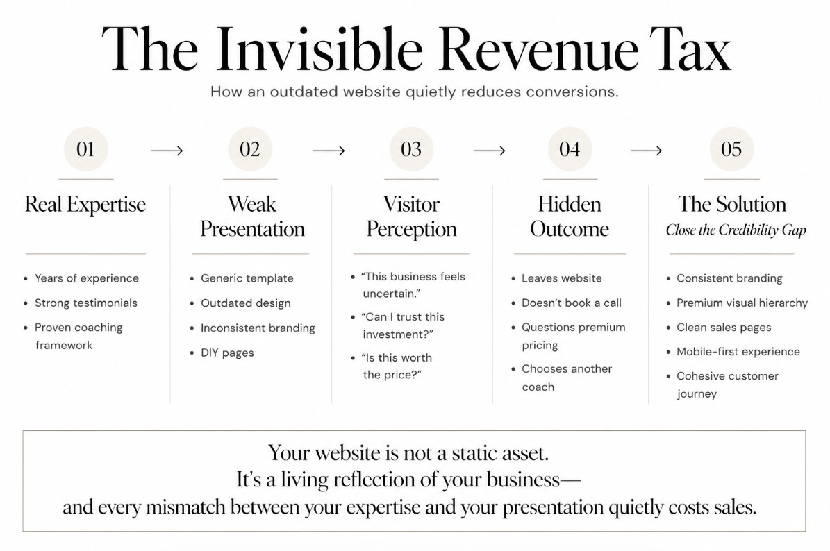
This is the gap I see most often. A coach with real expertise, strong testimonials, and a proven framework, paired with a website that was built in a weekend three years ago and never touched again.
The expertise didn't change. The market's expectations did. Coaches at every level are investing in how their businesses look online, and prospective clients are comparing you against all of them, whether or not that comparison feels fair.
Your website isn't a static asset you build once. It's a living reflection of where your business is right now. When there's a gap between how good your coaching actually is and how good your website looks, that gap becomes a tax on every sale you try to close.
I think of it as a quiet tax because you rarely see it directly. Nobody emails you to say they didn't book a call because your homepage felt outdated. She just closes the tab and keeps scrolling. The lost revenue is real, but it's invisible, which is exactly why so many strong coaches let this gap sit for years without addressing it.
How to close the gap without a full rebuild
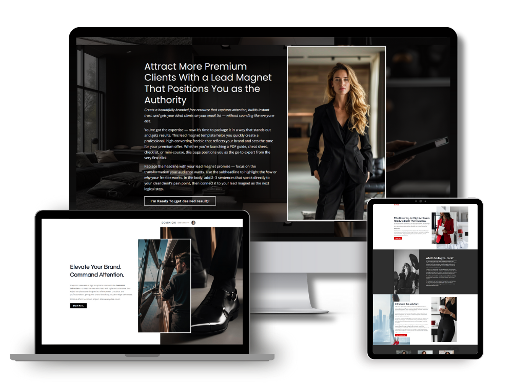
You don't need a six-month custom design project to fix this. Most of the coaches I work with close this gap in a weekend, using a Kajabi template built specifically for their kind of business.
A well-built template gives you the cohesive system a custom designer would charge thousands for: matched fonts, an intentional color palette, page layouts built around how high-ticket coaching actually sells, all ready to customize with your own words and images. You get the credibility signal without the timeline or the price tag of starting from scratch.
If your website has been quietly underselling your coaching, that's worth fixing before your next launch, not after it.
Browse the Kajabi Website Templates collection and find a design built to match the caliber of coach you actually are.
In my next article I will cover how to set up a Kajabi Sales Agent on any of your Kajabi sales pages.
Simon
Articles in this series:
- Premium Branding for Coaches: How Design Impacts Trust, Pricing, and Sales
- Why Most Coaching Websites Look Cheap (And How to Fix It)
- Aesthetic Website Design for Coaches: Why Luxury Brands Convert Better
- Canva & Kajabi: How Coaches Create A Cohesive Branding Across Platforms
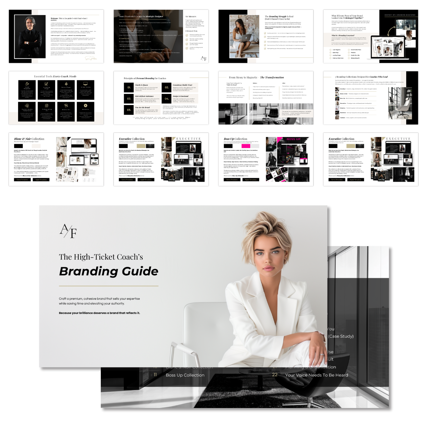
Grab my free High Ticket Coach Branding Guide
A free guide for coaches, consultants, and creators who are ready to ditch the DIY look and step into a cohesive, premium brand presence that sells.
We hate SPAM. We will never sell your information, for any reason.