Canva + Kajabi: How Coaches Create a Cohesive Brand Across Platform
Jul 12, 2026
I once scrolled through a coach's Instagram, clicked to her website, and genuinely wondered if I'd landed on the wrong page.
Different fonts. Different colors. A logo that didn't match what she'd been posting for months. Nothing was wrong exactly, but nothing felt connected either.
That disconnect is more common than you'd think, and it's quietly undermining a lot of otherwise strong coaching brands.
Why Brand Inconsistency Is Costing You Credibility
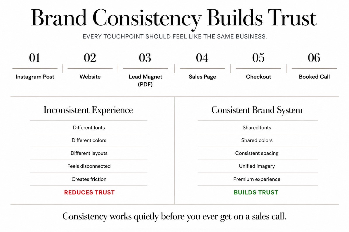
Your potential clients don't experience your brand in one place. They see a post on Instagram, click through to your website, maybe open a PDF lead magnet, then land on your checkout page.
If each of those feels like a different business, that's friction. Not dramatic friction, just a quiet, cumulative sense that something's a little off.
High-ticket buyers are especially sensitive to this. They're not just evaluating your offer. They're evaluating whether you run a tight, considered operation, because that's a preview of what it's like to work with you.
Consistency isn't about being rigid or boring. It's about making sure every touchpoint reinforces the same impression instead of chipping away at it.
Where Coaches Usually Lose Cohesion (Canva vs Kajabi)
Most coaches build their brand in two separate worlds without realizing it.
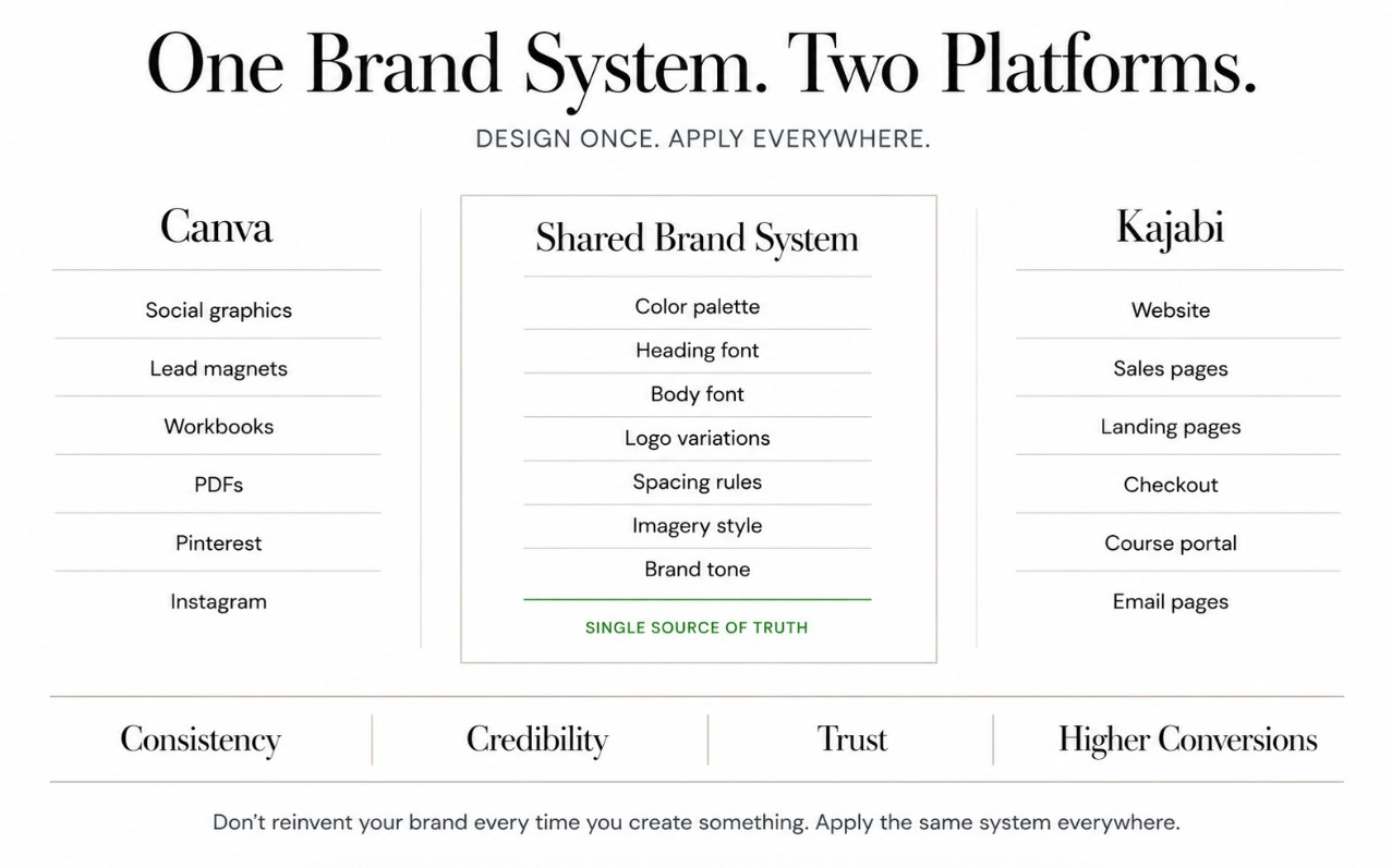
Canva becomes the home for social graphics, lead magnets, workbooks, and quote posts. Kajabi becomes the home for the website, sales pages, and checkout. Because these live in different tools, they often get designed at different times, in different moods, with different fonts pulled from whatever felt right that day.
Six months later, the Canva graphics and the Kajabi website barely look related. Nobody planned for that to happen. It's just what happens by default when there's no shared system connecting the two.
The fix isn't using fewer tools. It's making sure both tools are pulling from the same source.
Building Your Brand System Once, Applying It Everywhere
A brand system is simply the small set of decisions that everything else gets built on: your color palette, your fonts, your logo variations, and a general sense of tone and imagery.
The mistake most coaches make is treating this as something they figure out on the fly, page by page, post by post. It works better in reverse. Decide it once, then apply it consistently everywhere.
This doesn't need to be complicated. A primary color, one or two accent colors, a heading font, a body font, and a clear sense of whether your brand leans warm or bold, minimal or rich. That's enough to keep Canva and Kajabi speaking the same visual language.
Once that system exists, every new graphic or page becomes a matter of applying it, not reinventing it.
Fonts, Colors, and Spacing: Keeping Canva and Kajabi in Sync
The details matter more than they seem to.
In Canva, save your brand fonts and colors as a brand kit so they're one click away every time you design something new, rather than re-selecting them from memory. In Kajabi, make sure your site-wide font and color settings match that same kit exactly, not just approximately.
Spacing and imagery matter just as much as color. If your Canva graphics are airy and minimal but your Kajabi pages are dense and text-heavy, that's still a mismatch, even if the colors technically line up. The feeling has to match, not just the hex codes.
A simple gut check: screenshot your homepage and your last five Instagram posts side by side. If they don't immediately read as the same brand, something in the system needs tightening.
Templates as the Shortcut to Consistency
Building this kind of cohesion from scratch, across two platforms, takes real time. Most coaches don't have a spare week to build a matching design system in both tools.
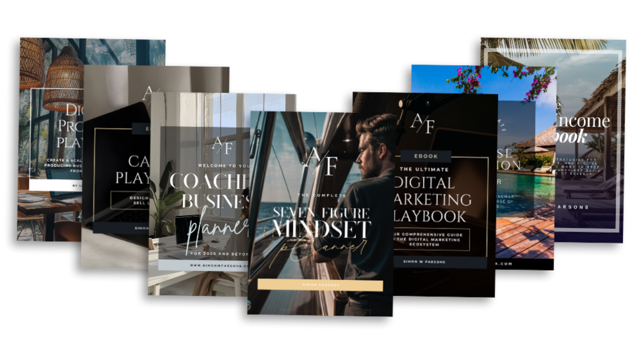
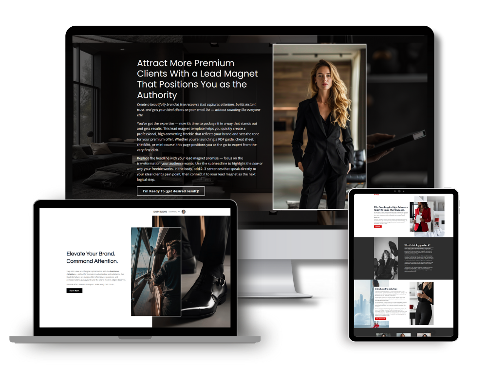
This is exactly why I design templates for both sides. My Kajabi templates give you a considered, premium website structure with the fonts, colors, and layout logic already worked out. My Canva templates for coaches are built to complement that same aesthetic, so your social graphics, lead magnets, and workbooks feel like they came from the same brand as your website, because they were designed to.
Instead of building your brand system from a blank page in two different tools, you're starting from a system that was already designed to work together.
What This Looks Like in Practice
Picture a potential client who finds you on Pinterest, clicks through to a lead magnet, opens the PDF, then visits your website to book a call.
If every one of those touchpoints feels unmistakably like you, that consistency is doing real work before you ever get on a call together. It builds trust quietly, in the background, without you having to say a word about it.
That's the outcome a matched Canva and Kajabi system creates. Not just a nicer-looking brand, but a more convincing one.
If you're ready to bring that kind of cohesion to your own brand, start with my Canva Templates for Coaches collection, then pair it with a matching Kajabi Templates for Coaches design to complete the system.
Simon
Articles in this series:
- Premium Branding for Coaches: How Design Impacts Trust, Pricing, and Sales
- Why Most Coaching Websites Look Cheap (And How to Fix It)
- Aesthetic Website Design for Coaches: Why Luxury Brands Convert Better
- What Your Website Says About Your Coaching Brand
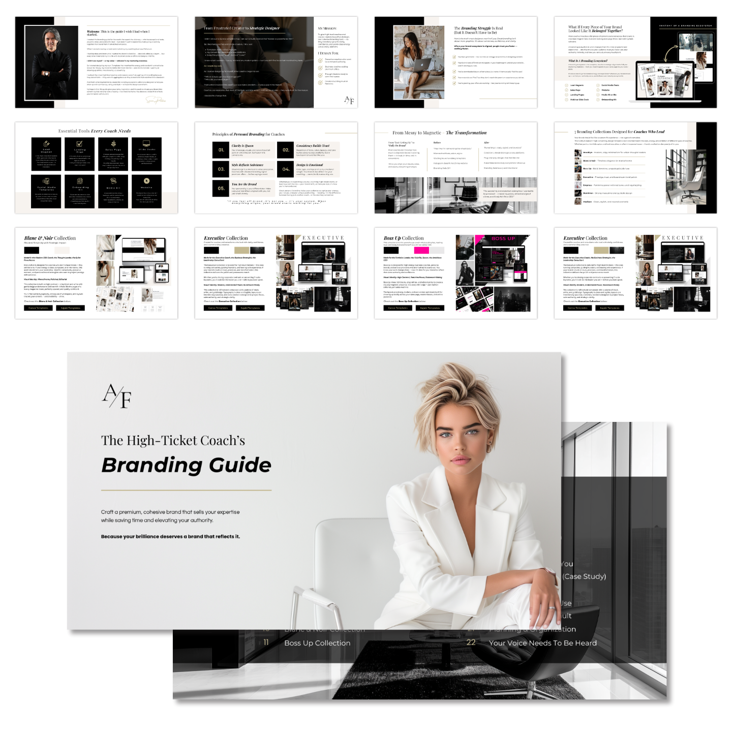
Grab my free High Ticket Coach Branding Guide
A free guide for coaches, consultants, and creators who are ready to ditch the DIY look and step into a cohesive, premium brand presence that sells.
We hate SPAM. We will never sell your information, for any reason.