Premium Branding for Coaches: How Design Impacts Trust, Pricing, and Sales
May 02, 2026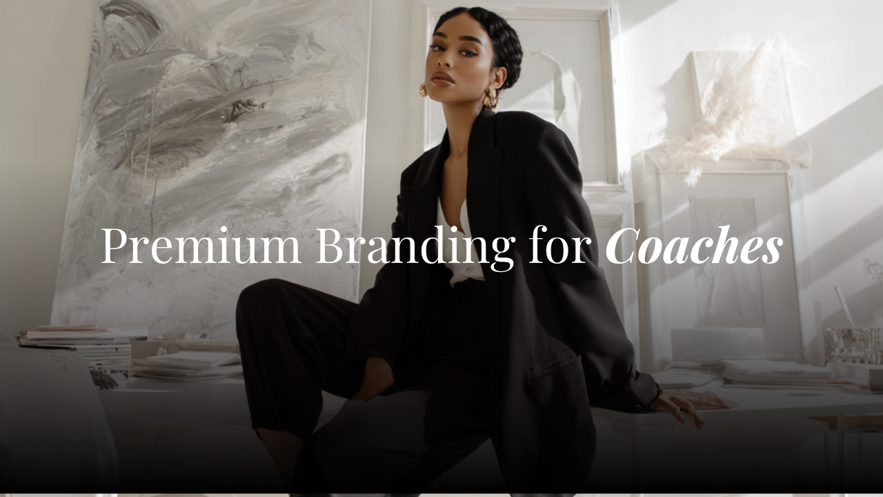
Your potential client has already made a judgment about you before she reads a single word on your website.
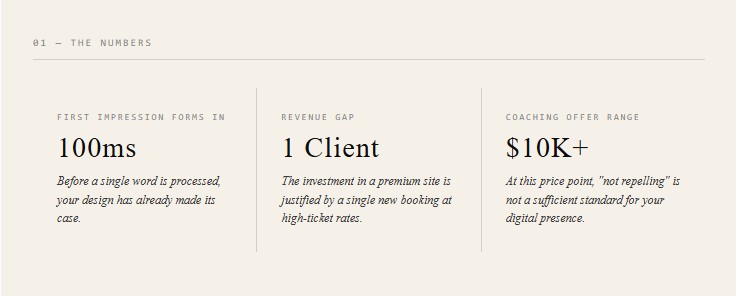
That's not a metaphor. Research consistently shows that visual impressions form in under 100 milliseconds — and those first impressions drive decisions about credibility, pricing, and whether someone stays on your page or bounces. For coaches selling high-ticket offers, this has serious implications.
Premium branding isn't about vanity. It's a revenue strategy.
Your Design Is Making a Price Argument Before You Do
When someone lands on your website, her brain is running a quick calculation: Does this match what she's charging?
If you're offering a $5,000 coaching package but your website looks like it was built in 2017 with a free theme, there's a disconnect. She might not be able to name it, but she feels it. And that feeling becomes hesitation. Hesitation kills conversions.
The inverse is also true. A site that looks considered, premium, and intentional signals that you take your work seriously — and that you expect your clients to take it seriously too. Design is doing sales work, quietly, the moment someone arrives.
The Psychology Behind First Impressions Online
Humans are wired to assess trustworthiness through visual cues. We do it with people, with products, and with websites. The signals your site sends — color palette, typography, white space, image quality, layout structure — are processed emotionally before they're processed rationally.
For coaches, trust is the entire sale. A client is investing in you, your methodology, and your ability to guide her. If your digital presence feels inconsistent or unpolished, it quietly undermines confidence in everything else you're telling her.
The coaches who command premium prices aren't necessarily the most well-known. They're often simply the ones whose brand communicates authority and intentionality at every touchpoint.
What Premium Actually Looks Like (and What It Doesn't)
Premium doesn't mean all-white with a script font and a stock photo of someone laughing with a coffee. That's a cliche that has become so common it now signals generic, not luxurious.
What premium actually communicates:
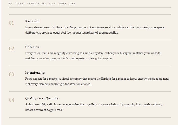
Restraint. Not every element needs to fight for attention. Premium design uses space deliberately. Breathing room is not emptiness — it's confidence.
Cohesion. Every color, font, and image style working as a unified system. A brand that looks pulled-together, even across multiple pages.
Intentionality. Fonts chosen for a reason. Section layouts that guide the eye. A visual hierarchy that makes it easy for the reader to know exactly where to go next.
Quality over quantity. A few beautiful, well-chosen images rather than a gallery that slows your site and overwhelms the eye.
What premium does not look like: ten different font sizes, neon buttons on a pastel background, stock photos that feel borrowed rather than owned, or a homepage that tries to say everything at once.
Why High-Ticket Coaches Can't Afford a Generic Website
There are coaches who get away with a basic website because they have a massive audience, strong referral networks, or a very loud social media presence. They're the exception.
For most high-ticket coaches — especially those building their online presence and trying to attract clients who don't already know them — the website is the pitch. It's where a cold lead becomes a warm one, or doesn't.
A generic website might not actively repel clients, but it fails to attract them. It doesn't give someone a reason to believe you're different from the other ten coaches she's already looked at. And when you're selling a $3,000, $5,000, or $10,000+ offer, "not repelling" is a very low bar.
The investment required to elevate your digital presence is small relative to a single new client. The math makes it one of the easiest decisions to justify.
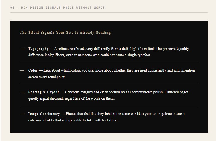
How Your Brand Design Signals Price — Without a Single Word
Think about the brands you perceive as high-end. Chances are, there are specific visual cues doing that work — even if you've never consciously analyzed them.
Typography plays a larger role than most coaches realize. A refined serif or a well-chosen editorial font reads very differently to a default platform font. The difference in perceived quality is significant, even to someone who couldn't name a single font.
Color psychology matters, but not in the oversimplified way you might expect. It's less about what colors you use and more about whether they're used consistently and with intention. A dusty sage, a warm ivory, and a deep navy are not inherently more or less premium than another palette — but the way they're combined, repeated, and balanced across your site tells a story about how much care went into your brand.
Layout and spacing communicate too. Cluttered pages feel low-budget, regardless of the actual content quality. Generous spacing, intentional alignment, and clean section breaks communicate polish.
And image quality — not just resolution, but style, tone, and consistency — is one of the fastest ways to elevate or undermine a brand aesthetic. Photos that feel like they were shot in the same world as your color palette create a cohesive visual identity that's hard to fake with text alone.
The Connection Between Consistent Branding and Client Confidence
There's a specific kind of trust that builds when everything matches.
When your Instagram feels like your website feels like your sales page feels like your welcome email, something happens in the client's mind: she's got it together. And if she's got her own brand together, maybe she can help me get mine together.
For business coaches, this is almost literal. For life coaches, executive coaches, and personal trainers, the logic still holds — your brand is evidence of your professional standards.
Inconsistency, on the other hand, creates doubt. Doubt is silent and hard to overcome. Most clients won't tell you your fonts don't match your colors. They'll just not book.
A cohesive Kajabi website — one where the template, typography, and imagery all align with your brand identity — removes that doubt before it has a chance to form.
What This Means for Your Kajabi Website
If you're running your online coaching business on Kajabi, your website is your primary sales asset. It's where your offers live, where your email list grows, and where discovery calls get booked.
Kajabi gives you real flexibility in how your site looks and functions — but a blank Kajabi page, or one built on a default template, isn't going to get you there. The platform is only as good as the design you put on top of it.
A well-designed Kajabi template does the heavy lifting for you. The typography hierarchy is already set. The spacing is already calibrated. The section layouts are already built to guide the reader toward a decision. You're not starting from scratch — you're customizing a framework that was designed specifically for coaches who want a premium online presence.
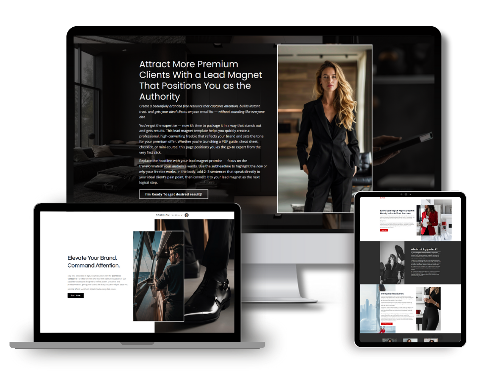
The Brooklyn Collection was built with exactly this in mind. Each layout is designed to communicate premium positioning from the first scroll, so that by the time a potential client reaches your offer or booking link, she's already sold on working with someone who clearly operates at a high level.
If you're ready to have a Kajabi website that does its own convincing, take a look at the Kajabi templates for coaches — designed for high-ticket offers and built to convert.
In my next article, I'll share how you can build a Sales Funnel in Kajabi.
Simon
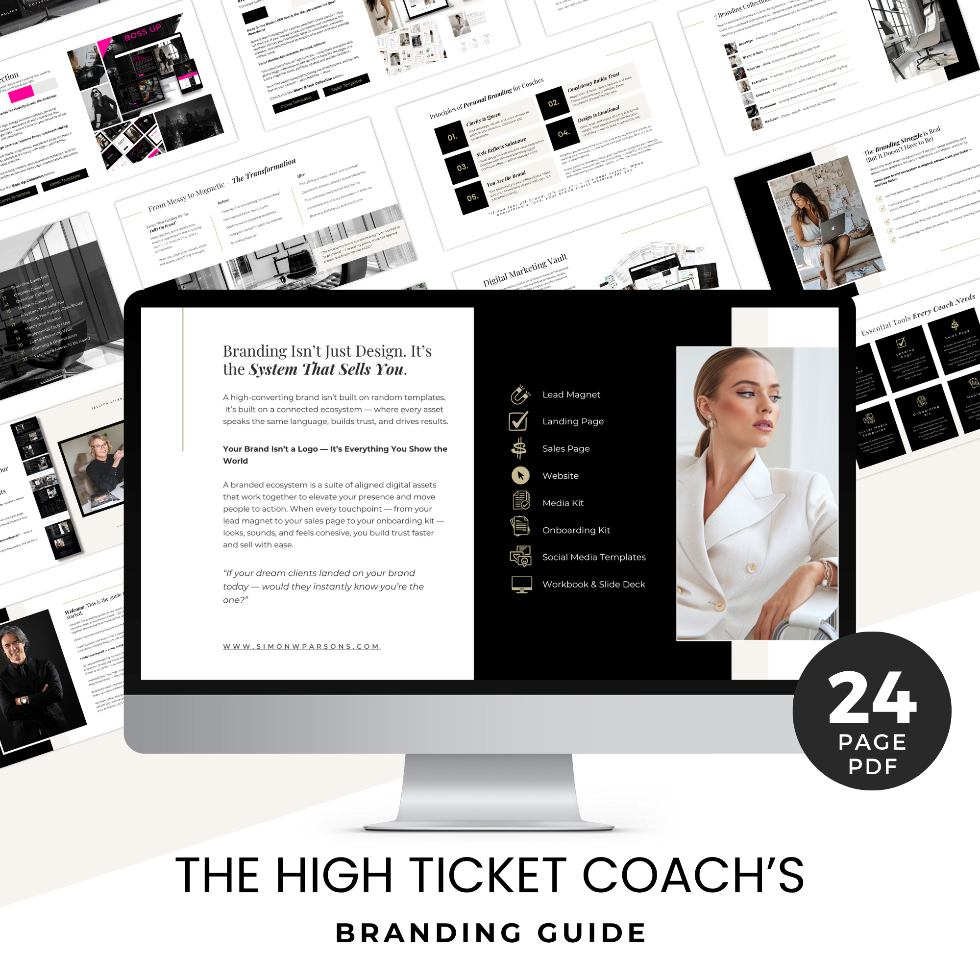
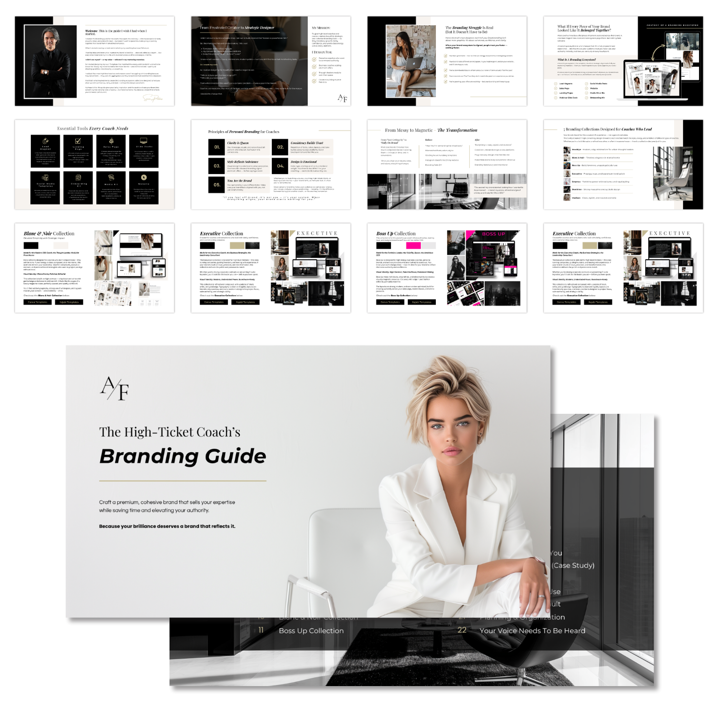
Grab my free High Ticket Coach Branding Guide
A free guide for coaches, consultants, and creators who are ready to ditch the DIY look and step into a cohesive, premium brand presence that sells.
We hate SPAM. We will never sell your information, for any reason.