Why Most Coaching Websites Look Cheap (And How to Fix It)
May 21, 2026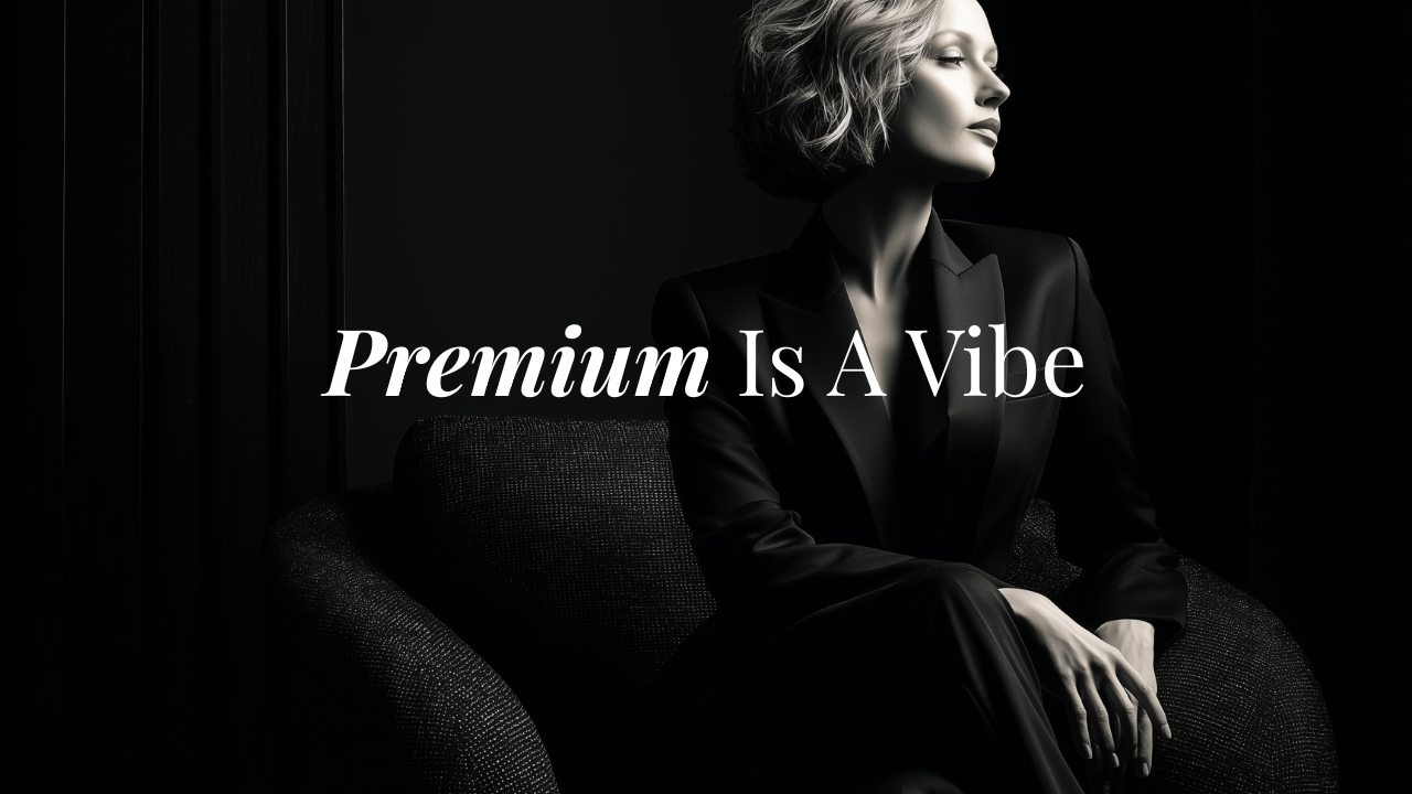
Most coaches undercharge their website long before they undercharge their clients.
You've spent years building your expertise. You've invested in branding, in photos, maybe even in a designer at some point. But something still feels off. The site looks busy, or flat, or just... generic. And you know it.
The problem isn't effort. The problem is usually a small set of fixable design decisions that quietly signal "amateur" to every visitor who lands on your page.
Here's what's going wrong, and how to fix it.
Your website is making a first impression whether you like it or not
Research consistently puts the time it takes a visitor to form an opinion about a website at under two seconds. That's not enough time to read a word of your copy. It's enough time to register how your site feels.
For high-ticket coaches, that feeling is everything. A client considering a $5,000 or $10,000 investment isn't just evaluating your credentials. She's evaluating whether she trusts you to lead her. And trust, in that split second, is communicated almost entirely through design.
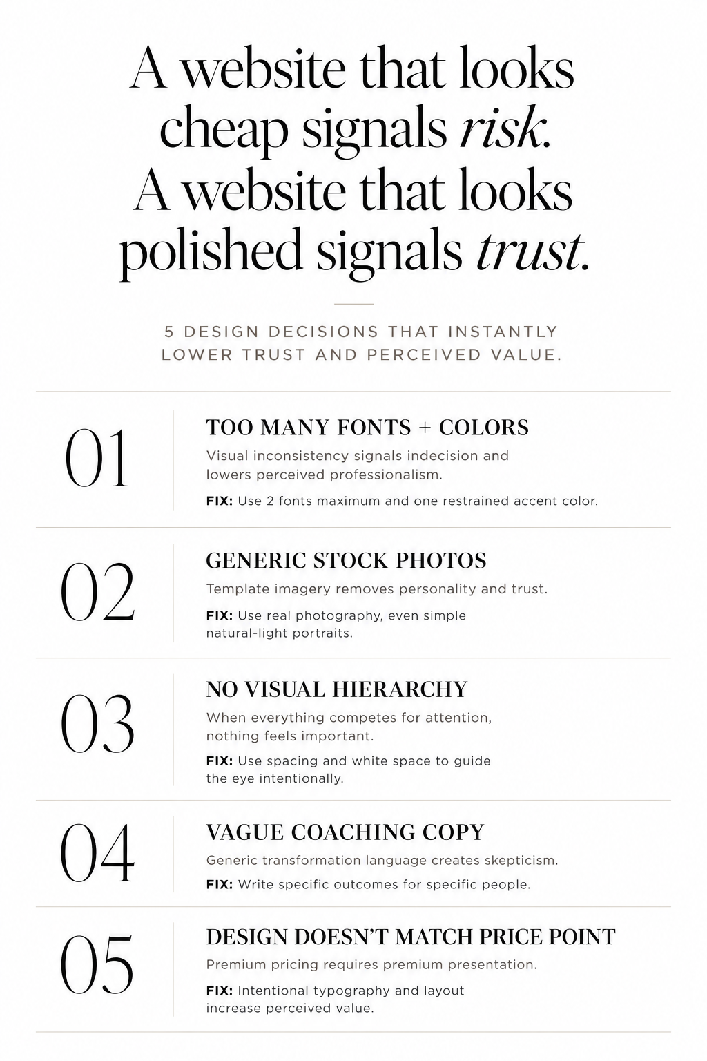
A website that looks cheap signals risk. A website that looks polished signals that you take your business seriously.
The biggest reasons coaching websites look cheap
Most cheap-looking coaching sites share the same handful of problems. The good news: every single one of them is fixable.
Too many fonts, too many colors
This is the number one design mistake I see on coaching websites. Multiple typefaces. Headings in one font, body copy in another, buttons in a third, pull quotes in something else entirely.
The same goes for color. When a website uses five, six, seven colors with no clear hierarchy, it looks unfinished. Like a mood board that never made it to a final decision.
Simplified design reads as confidence. Stick to two fonts maximum — one display typeface for headings, one clean font for body copy — and limit your palette to two or three colors with one clear accent.
Stock photos that scream "template from 2017"
You know the ones. Woman at a laptop, looking delighted by something on her screen. Group of people in a meeting room, gesturing. Man standing in front of a whiteboard.
Generic stock imagery tells visitors nothing about you, and it makes your site look like thousands of others. If you're a coach, your face needs to be on your website. Real photos of you, in your space, at work, signal presence and credibility in a way no stock image can.
If you don't have brand photography yet, even a well-lit phone photo of you beats a stock image of someone else.
A layout that doesn't guide the eye anywhere
A cluttered layout feels cheap not because there's too much on the page, but because there's no clear visual hierarchy. The eye doesn't know where to go first, second, or third. Everything competes equally for attention.
Premium website design uses white space deliberately. It creates breathing room. It slows the reader down and says: this section matters, pay attention here.
If your site has content packed edge to edge, or sections that feel like they were added as afterthoughts, that's where the cheap feeling often comes from.
Copy that sounds like everyone else (or like AI fluff):
"Welcome to my corner of the internet."
"I help women step into their power."
"Are you ready to transform your life?"
"It' isn't about this, it's about that."
"Whether you are this, or that."
These phrases appear on thousands of coaching websites. If your copy could belong to any coach on the internet, it belongs to none of them.
The fix here isn't writing more. It's writing more specifically. Who do you actually help? What's the real problem they're walking around with before they find you? What changes after they work with you?
Specific, grounded copy creates trust. Vague, inspirational copy creates skepticism.
The design doesn't match the price point
This one is harder to articulate but immediately obvious when you see it.
A coach charging $8,000 for a six-month program, on a website that looks like it was built in an afternoon on a free theme, creates cognitive dissonance. The visitor does the math and it doesn't add up.
High-ticket clients are buying a result and a relationship, but they're also buying into your world. If your world looks low-budget, they'll wonder if your results are too.
This doesn't mean you need to spend thousands on a custom website. It means the design needs to be intentional. Clean typography, a cohesive aesthetic, photography that matches your brand. These things cost less than you think when you know where to invest.
What a premium coaching website actually looks like
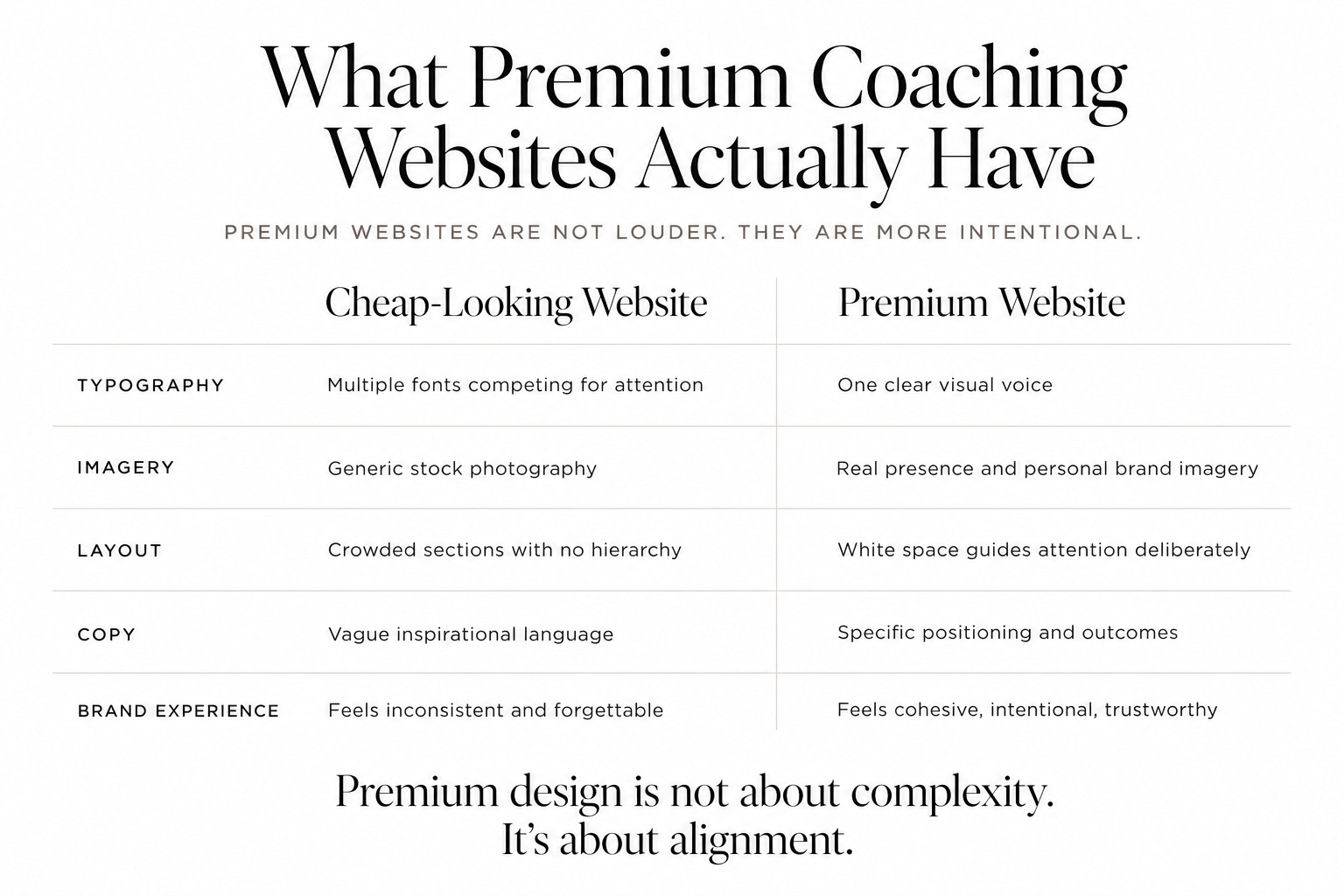
A premium coaching site isn't necessarily minimal or maximalist, dark or light, bold or soft. The aesthetic can vary enormously depending on the coach and her brand.
What premium sites share is intentionality. Every element earns its place. The fonts, the colors, the section order, the way white space is used — it all points in the same direction. There's a clear visual voice, and it matches the brand voice in the copy.
When those two things align, design and copy, the result doesn't just look expensive. It converts.
You don't need a custom build to look high-end
The misconception I hear most often from coaches is that looking premium means hiring a web designer for $5,000 or $10,000 and starting from scratch.
It doesn't.
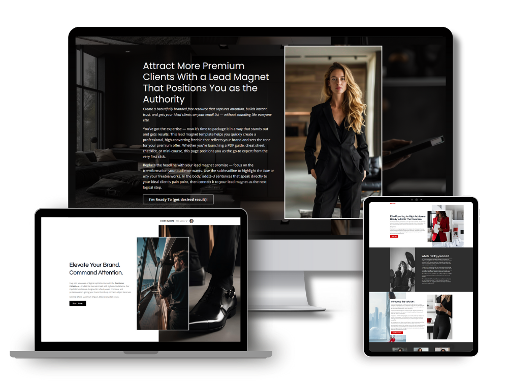
Kajabi templates built specifically for high-ticket coaches can give you that polished, intentional look without a custom build. The difference between a well-designed template and a generic one is significant — and that difference matters when your site is the first impression a potential client gets of your brand.
I designed the Brooklyn Collection for exactly this reason. It's built for coaches who want their Kajabi website site to look like a premium brand, not a starter website.
The fastest way to fix a cheap-looking coaching website
Start with an audit. Open your site and ask yourself these five questions:
- How many fonts am I using? (Target: two max)
- How many colors are on this page? (Target: three, with one dominant)
- Is my face on the homepage? (It should be)
- Does my copy name my client's actual problem? (Specifically, not generally)
- Would a stranger guess my price point from this design alone?
If the answers make you wince, that's useful information. It means the gap between where you are and where you need to be is visible, and visible problems are solvable ones.
The goal isn't a perfect website. It's a website that does its job: building trust quickly, communicating your positioning clearly, and moving the right people toward working with you.
If your current site isn't doing that, start there.
Browse the Kajabi website template collection and find a design that actually matches the caliber of your work.
In my next article I will discuss how I use Etsy & Kajabi to attract new clients.
Simon
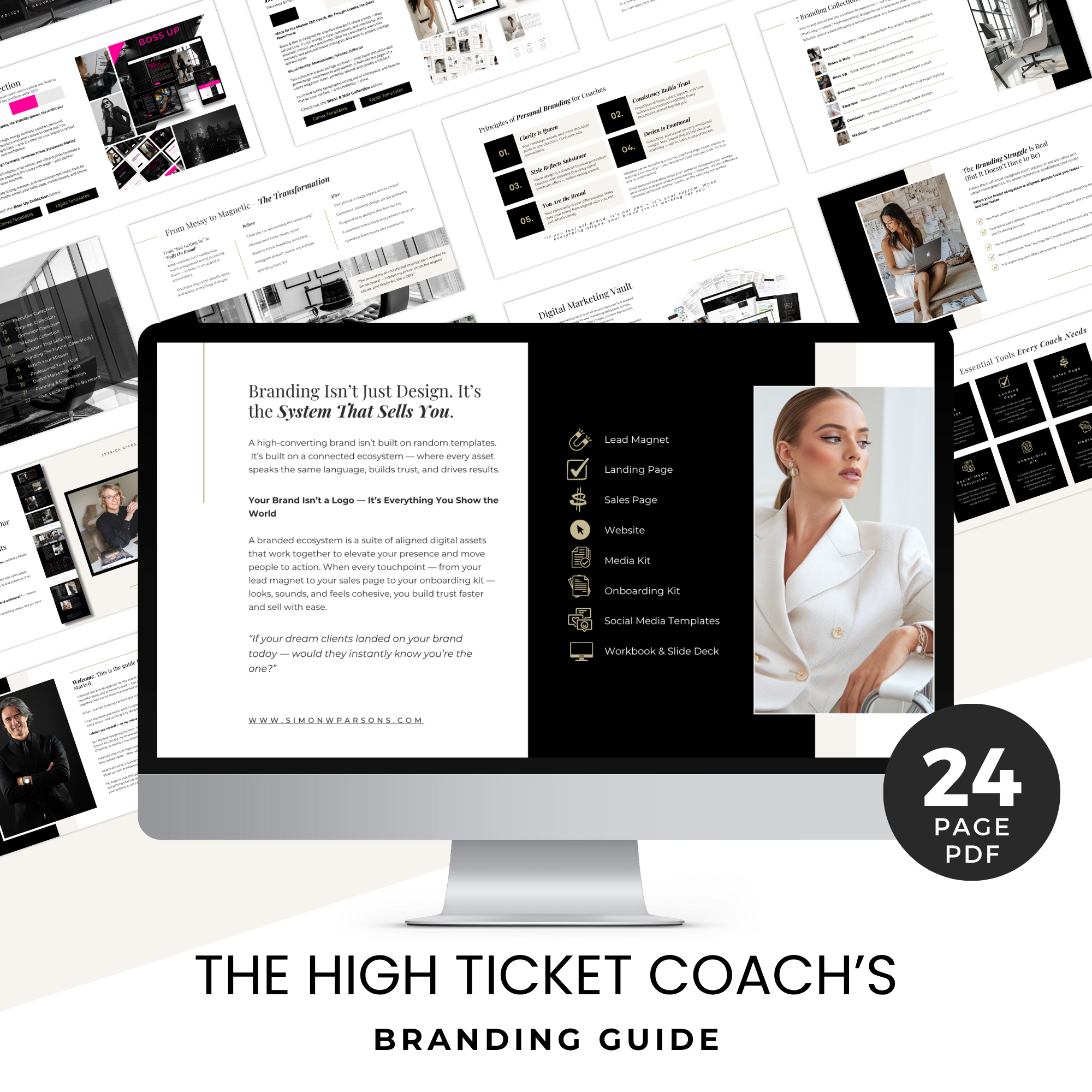
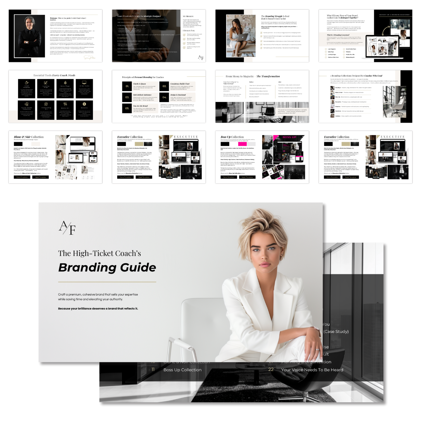
Grab my free High Ticket Coach Branding Guide
A free guide for coaches, consultants, and creators who are ready to ditch the DIY look and step into a cohesive, premium brand presence that sells.
We hate SPAM. We will never sell your information, for any reason.