Kajabi Page Layouts That Tend to Increase Trust and Conversions
Mar 07, 2026
If you’ve ever landed on a website and instantly felt confident about the person behind it, you’ve experienced the power of layout.
Before someone reads every word, before they fully understand the offer, their brain is already forming an impression based on how the page is structured.
This matters a lot for coaches.
Most coaching businesses rely heavily on trust. People are deciding whether they believe in your expertise, whether they feel safe investing with you, and whether your work feels aligned with the level of transformation you promise.
The structure of your pages quietly influences all of that.
Over the years of building Kajabi templates and watching how coaches actually use them, I’ve noticed certain page layouts consistently perform better than others. They guide the reader naturally, remove friction from the decision process, and create a sense of calm clarity rather than overwhelm.
Let’s walk through a few layouts that tend to work particularly well.
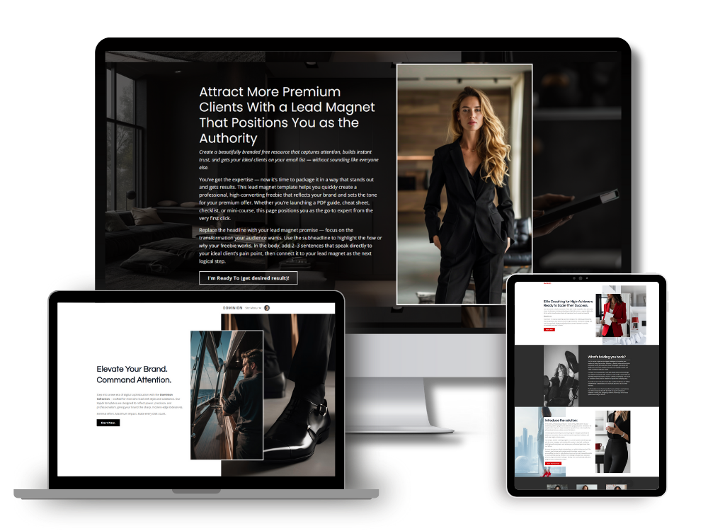
The Clear Hero Section
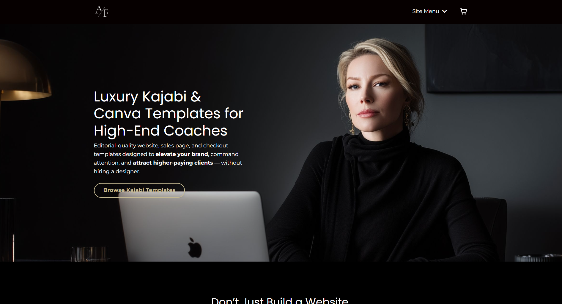
The first section of a page carries more weight than most people realize.
When someone lands on your site, they should immediately understand three things:
-
who the offer is for
-
what transformation you help create
-
what step they can take next
If the opening section is vague or overly decorative, visitors end up doing extra work trying to interpret what the business actually does.
Layouts that convert well usually keep the hero area simple. A strong headline, a short supporting sentence, and one clear call-to-action are often all that’s needed. The surrounding visuals help reinforce the feeling of professionalism and credibility, but they don’t compete with the message.
When the first section feels organized and intentional, the rest of the page becomes easier to follow.
The Guided Scroll Layout
One of the biggest advantages of a well-designed Kajabi page is how it gently guides someone through information in the right order.
Think of a page as a conversation.
First you introduce the idea. Then you explain the problem your audience is experiencing. After that you show them the solution and build confidence in why your method works. Finally you give them a clear way to move forward.
When the sections are arranged in this kind of logical progression, the reader doesn’t feel lost or forced to hunt for answers.
Layouts that jump around between topics or try to present everything at once tend to slow people down. Instead of following the story, they start scanning randomly, which weakens the impact of the page.
A thoughtful scroll structure keeps people engaged from beginning to end.
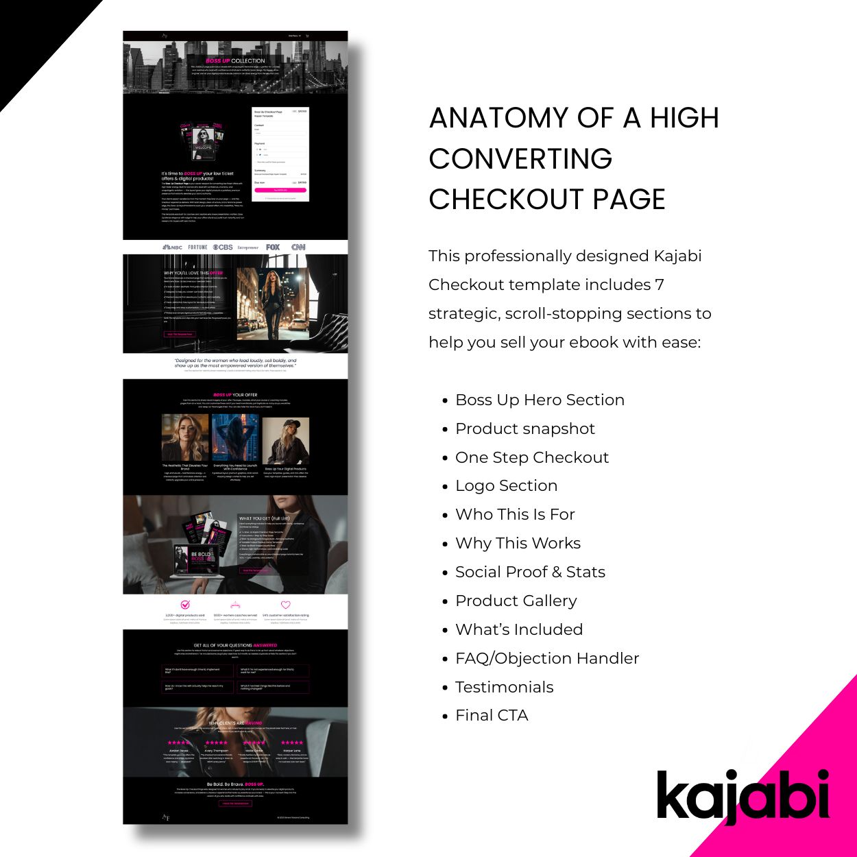
The Credibility Layer
Trust rarely comes from a single statement.
It grows through a series of signals that reassure the reader they’re in the right place.
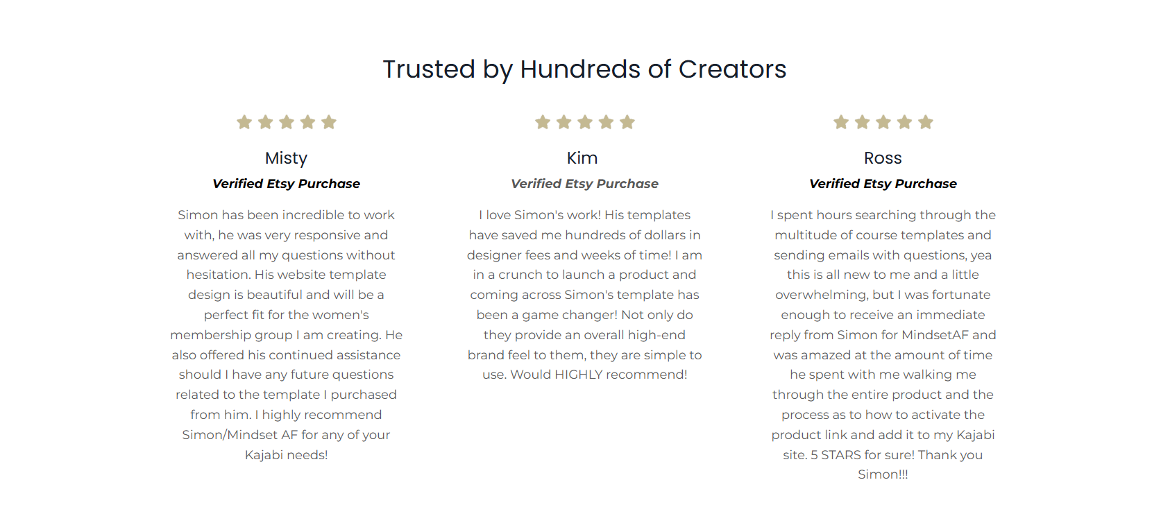
Strong page layouts usually create space for these signals without interrupting the flow of the page. Testimonials, brief case studies, media mentions, or recognizable client results all serve as reinforcement points throughout the experience.
Rather than placing all social proof in one large block, it often works better when credibility appears naturally between sections of explanation.
When readers see evidence woven into the story, confidence builds steadily as they move down the page.
The Focused Offer Section
Many pages struggle because the core offer is buried or explained in a confusing way.
A layout that converts well gives the offer its own dedicated section where everything becomes clear: what the program or service includes, who it is designed for, and what someone can expect if they join.
This part of the page benefits from visual organization. Breaking information into structured segments helps readers process the details quickly without feeling overwhelmed.
When the offer section feels clean and easy to understand, the next step in the process becomes much more natural.
The Decision Support Section
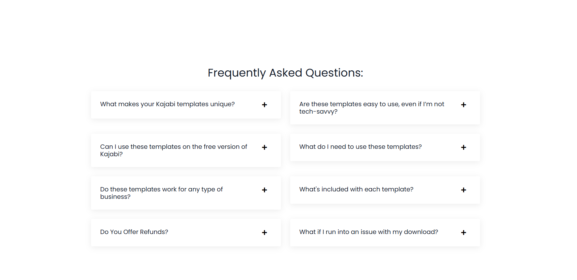
Even when someone is interested, a few quiet questions usually remain in their mind.
They may be wondering whether the offer is right for their situation, whether they have the time to implement it, or whether it’s the right moment to invest.
Thoughtful layouts anticipate those questions.
This is where sections like FAQs, short clarifications, or gentle reassurance about common concerns can help. When these elements are placed toward the end of the page, they support the final decision without disrupting the earlier flow of the story.
The reader feels understood rather than pressured.
The Final Call to Action
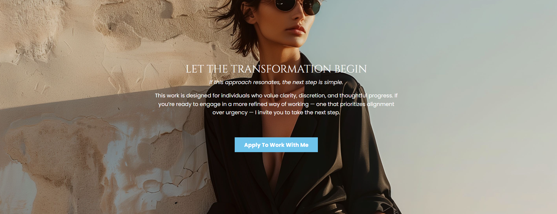
A page that builds trust eventually needs to lead somewhere.
By the time someone reaches the end, they should feel ready to take the next step. The final section simply makes that step obvious.
Sometimes this leads to a checkout page. Other times it invites someone to book a consultation or apply for a program.
When the page has done its job well, this final moment feels natural rather than forced.
The reader already understands the value of the offer and simply needs a clear path forward.
Why Layout Matters More Than Most People Expect
A lot of website conversations focus on colors, fonts, or individual design elements.
Those things certainly play a role, but layout is what determines how someone experiences the entire page.
A thoughtful structure keeps readers oriented. It helps them absorb information without confusion. It builds confidence as they move from curiosity to understanding to decision.
That’s why the Kajabi templates I build focus heavily on page flow and visual hierarchy. The goal is to give coaches a structure that already supports how people naturally evaluate offers online.
When the layout works with human behavior instead of against it, everything about the page becomes easier.
And that’s often where the difference between a page that looks nice and a page that actually converts begins.
In my next article, I'll give you a glimpse inside a powerful new feature inside of Kajabi called Cofounder.
Simon
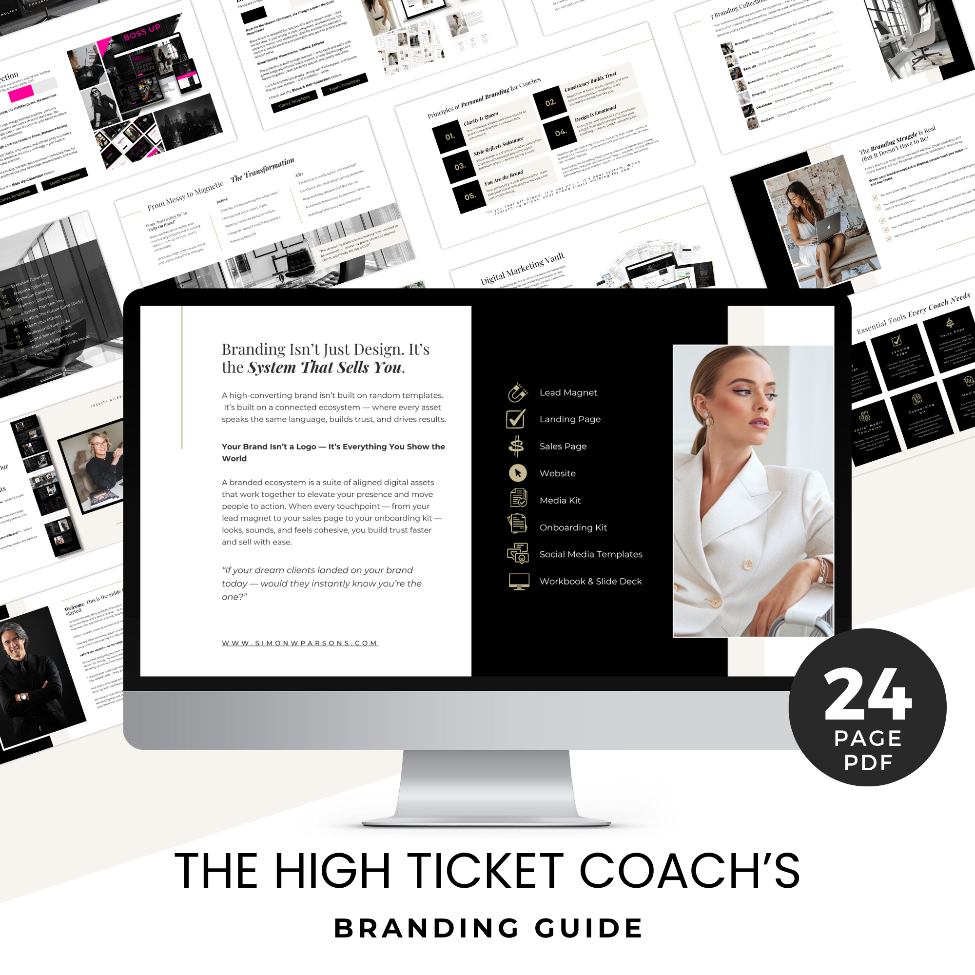
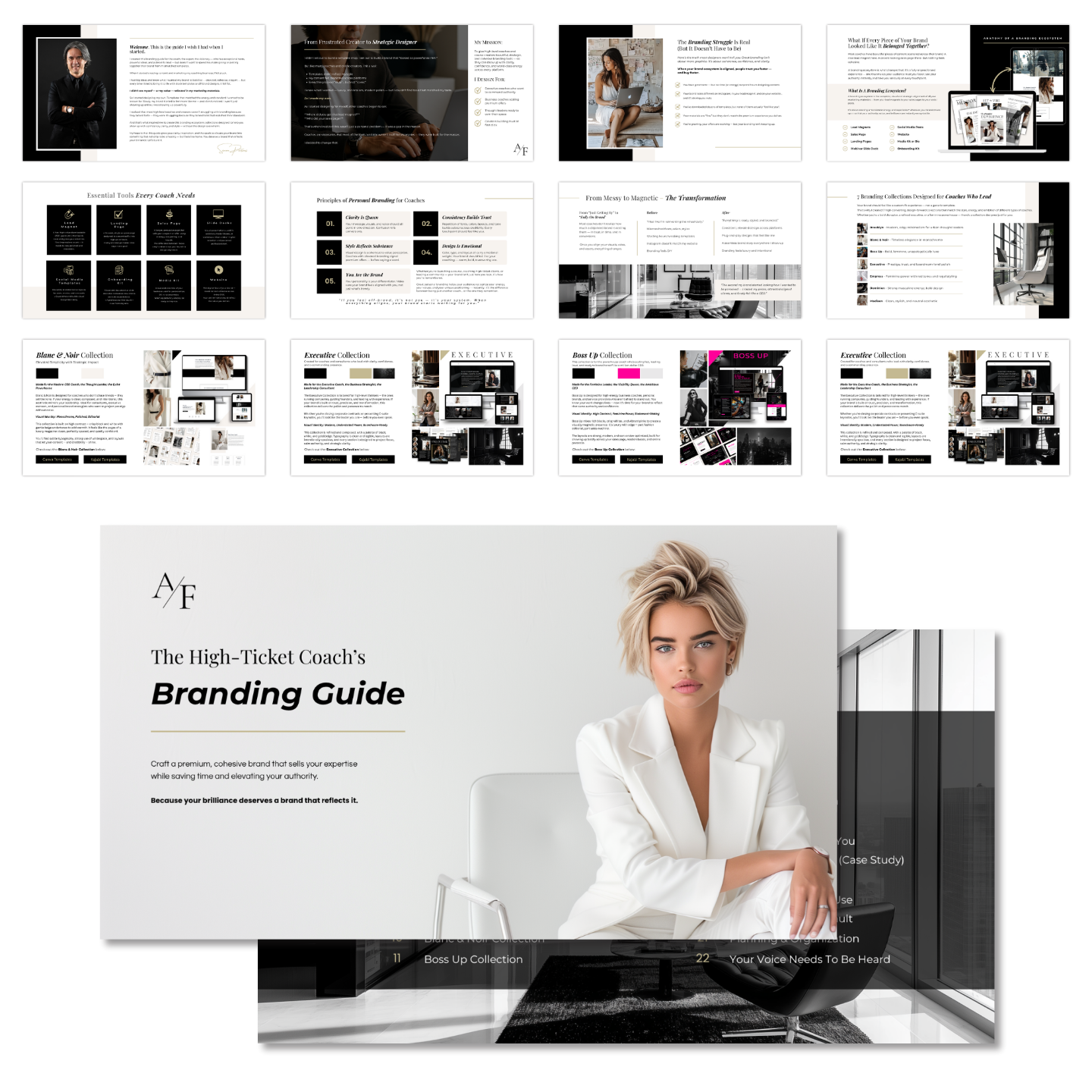
Grab my free High Ticket Coach Branding Guide
A free guide for coaches, consultants, and creators who are ready to ditch the DIY look and step into a cohesive, premium brand presence that sells.
We hate SPAM. We will never sell your information, for any reason.