How Checkout Page Templates Fit Into Your Kajabi Structure
Feb 19, 2026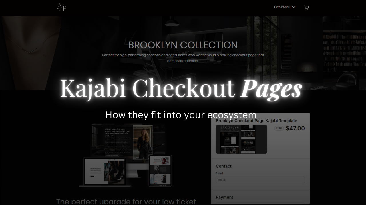
I want to talk about the part of your Kajabi setup that almost nobody reviews carefully.
The checkout page.
By the time someone reaches this page, the real decision has already happened. They’ve read the sales page. They’ve evaluated the offer. They’ve mentally justified the investment. The checkout page isn’t there to convince them. It’s there to carry the decision safely to completion.
That shift matters.
On your homepage, someone is exploring. On your sales page, they’re evaluating. On your checkout page, they’re assessing risk.
That’s a different psychological state.
When someone enters payment information, their sensitivity increases. Small inconsistencies feel bigger. A layout that feels slightly cluttered can suddenly feel uncertain. A brand shift that felt minor before now feels noticeable.
Most coaches don’t think about this because the checkout page looks simple. It feels transactional. It’s easy to assume Kajabi’s default setup is good enough.
Sometimes it is. Often it isn’t.

What makes a checkout template effective isn’t complexity. It’s stability. The page should feel visually aligned with the sales experience that led to it. The spacing should be clean. The hierarchy should be obvious. There shouldn’t be extra sections competing for attention or unnecessary copy trying to resell the offer.
Once someone clicks “Buy,” your job isn’t to re-explain the program. It’s to make the next step feel clear and grounded.
This becomes especially important with higher-ticket offers. The larger the investment, the more aware someone becomes of subtle friction. Even minor layout inconsistencies can create hesitation. That hesitation rarely shows up as feedback. It shows up as abandonment.
I’ve seen strong sales pages underperform simply because the checkout didn’t feel cohesive. Nothing was technically broken. It just didn’t feel resolved.
That’s why I treat checkout templates as part of the structural system, not an afterthought. Your website establishes your presence. Your sales page structures the offer. Your checkout page protects the final step.
When those three pieces feel aligned, the entire experience feels intentional from beginning to end.
If your sales page is performing but conversions stall near checkout, that’s where I would look first. Open the page with fresh eyes. Ask yourself whether it feels calm and consistent, or whether something subtly shifts when money enters the conversation.
You don’t need to redesign everything. You just need structural continuity.
That’s what a well-built checkout template provides.
Kajabi Checkout Pages for Low Ticket Offers
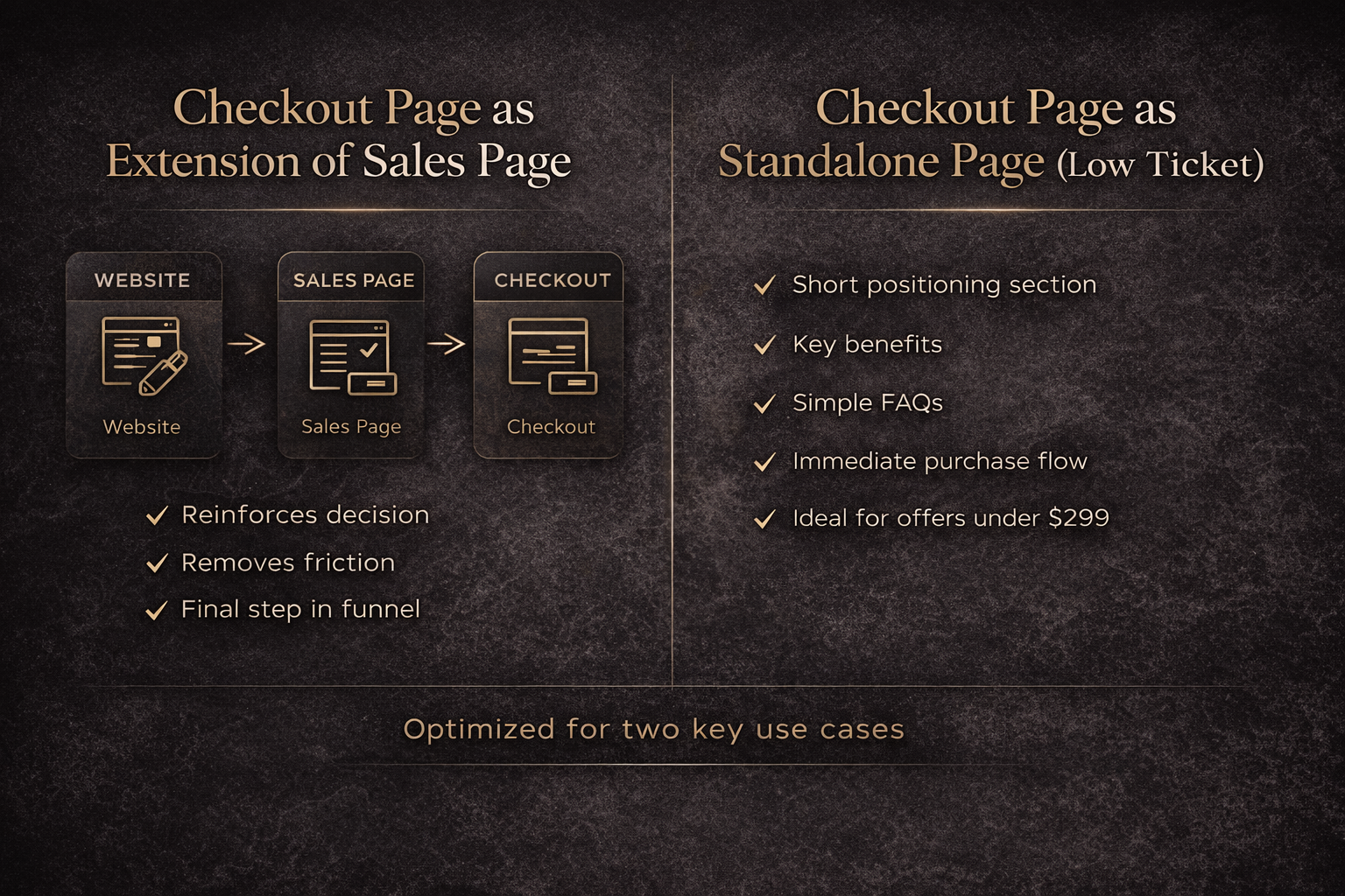
There’s another use case for checkout templates that often gets overlooked, and it’s one I intentionally design for.
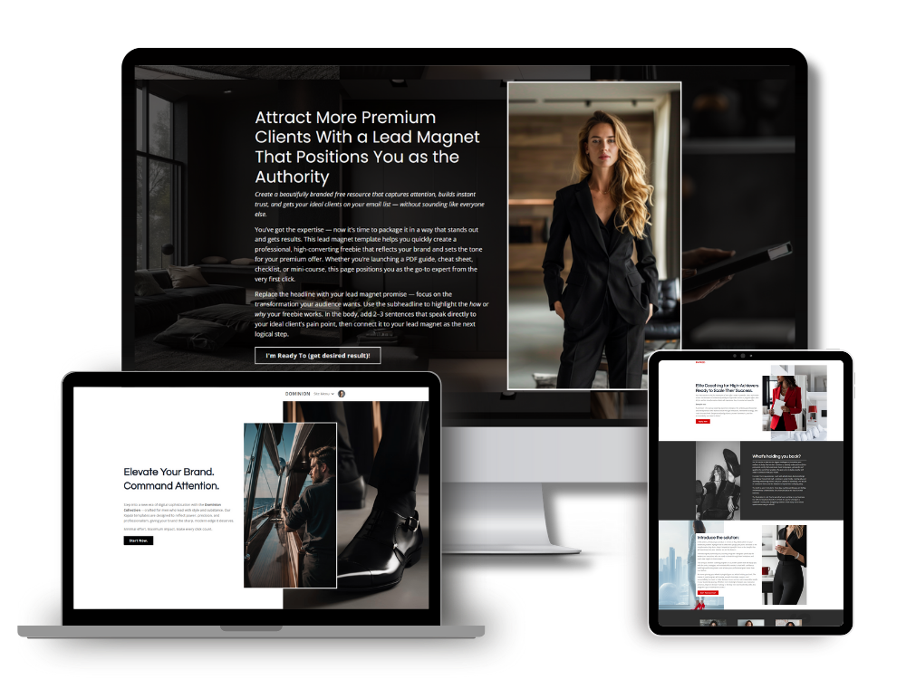
For lower-ticket offers — especially anything under $299 — a well-structured checkout page can function as a simplified sales page. When the price point is lower and the audience already has some level of trust with you, you don’t always need a long, persuasive build-up. You need clarity, confidence, and an easy path to purchase.
In those cases, adding more sections can actually slow the decision down.
A streamlined checkout layout allows you to introduce the offer, reinforce value, answer a few common questions, and move directly into the purchase flow without forcing the buyer through unnecessary friction. It respects the fact that they’re likely already warm.
This is why my Kajabi checkout templates are built the way they are.
They’re structured to support two scenarios: as the final step in a larger funnel, and as a standalone conversion page for low-ticket digital products. The layout gives you space for positioning and context without turning the page into a full-length sales letter. It keeps the buying process efficient while still feeling premium.
For high-end coaches who sell entry offers, workshops, mini-courses, templates, or paid masterclasses, this structure works extremely well. It protects momentum. It preserves trust. And it aligns with how modern buyers make smaller purchasing decisions.
When the friction is low, the page should reflect that.
That’s not an accident in my designs — it’s intentional.
Just a quick recap - this article was designed to compare the difference between a Kajabi sales page and checkout page template. In my next article, I'll share with you when to use a Kajabi sales page template and when to use a checkout page template.
Simon
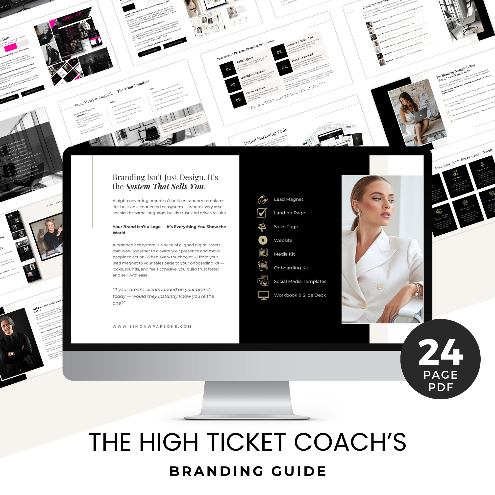
Grab my free High Ticket Coach Branding Guide
A free guide for coaches, consultants, and creators who are ready to ditch the DIY look and step into a cohesive, premium brand presence that sells.
We hate SPAM. We will never sell your information, for any reason.