Kajabi Website Design Mistakes That Cost Coaches Sales
Feb 26, 2026
I want to share something I’ve noticed after looking at a lot of Kajabi websites over the past few years.
Most coaches don’t lose sales because their offer is weak. They lose sales because their website feels unsettled.
That’s a subtle difference.
The offer might be strong. The testimonials might be solid. The transformation might be real. But when someone lands on the site, there’s a slight friction — a feeling that things aren’t fully resolved.
And people rarely say, “The layout felt inconsistent.”
They just leave.
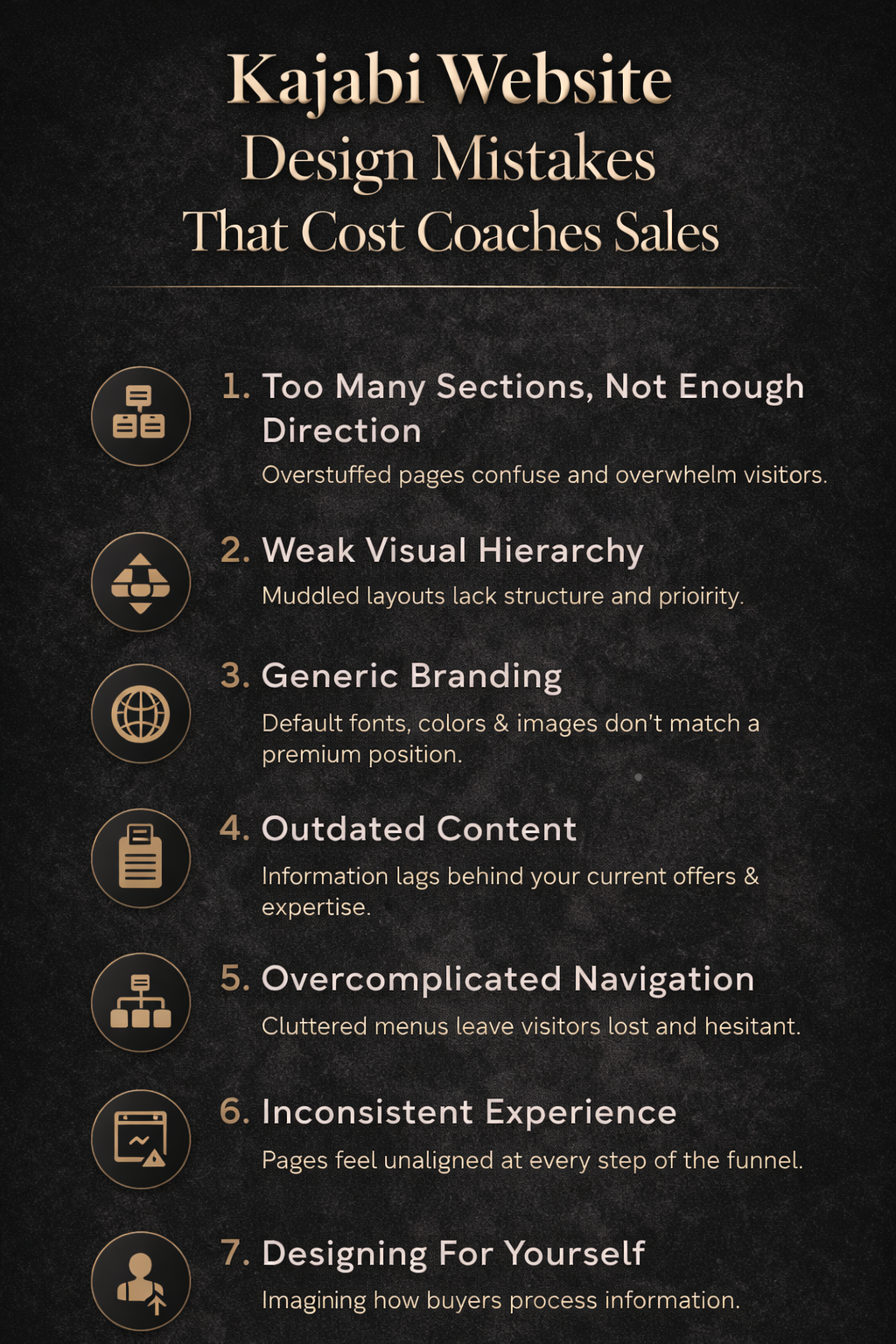
One of the most common issues I see is overbuilding.
Kajabi gives you flexibility, which is a gift. But it also makes it easy to keep adding sections. Another testimonial block. Another explanation. Another call to action. Another banner.
At some point, the page stops guiding and starts competing with itself.
When someone lands on your homepage, they’re orienting. They’re scanning for clarity. They want to understand who you help, how you help them, and what to do next. If the structure doesn’t lead them cleanly through that, attention starts to fragment.
Another quiet problem is hierarchy.
I don’t mean fonts in a technical sense. I mean visual weight. Flow. Spacing.
If everything on a page carries equal importance, the brain has to decide what matters. That’s exhausting. Strong websites make that decision for the reader. They create a natural progression so that someone moves through the page without having to think about how to move through the page.
You’d be surprised how often small spacing adjustments change how “premium” a site feels.
Brand alignment is another one that shows up often.
I’ll see a coach charging high-ticket rates with a site that looks like it was assembled from default settings. The colors don’t feel intentional. The typography feels generic. The overall aesthetic doesn’t reflect the level they’re operating at in real life.
It creates a quiet mismatch.
Your website doesn’t need to be dramatic. It needs to feel cohesive. When everything feels chosen — not accidental — the experience changes.
There’s also the issue of navigation.
When someone clicks “Work With Me,” they shouldn’t feel like they’ve opened a filing cabinet. If there are too many pathways, too many subpages, too many directions to go, people hesitate. Clear navigation reduces that hesitation. It creates forward motion.
And then there’s continuity.
I often see a homepage that feels polished, a sales page that feels slightly different, and a checkout page that feels like it belongs to another brand entirely. Individually, each page might be fine. Together, they don’t feel unified.
Consistency builds trust more than most people realize. When the experience feels stable from page to page, it lowers resistance.
None of this requires a fully custom design build.
It requires intention.
Most of the time, when a coach tells me their Kajabi site “isn’t converting,” what they really mean is that it doesn’t feel as strong as their work. That gap matters. Especially if you’re positioning yourself as premium.
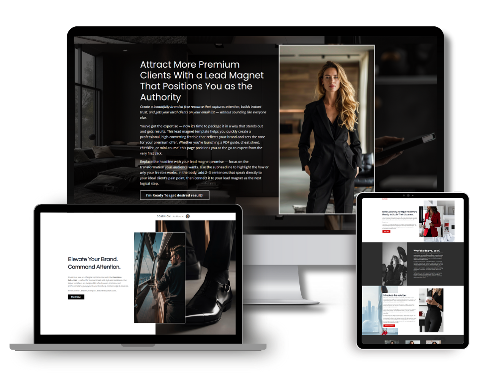
A structured template helps because it removes the guesswork. The hierarchy is already handled. The spacing is controlled. The pages are built to work together. Instead of constantly adjusting layout decisions, you can focus on refining your messaging and offers.
That shift frees up more mental space than people expect.
If you’ve had the sense that your site feels heavier than it should, or harder to maintain than it needs to be, it’s worth looking at structure before assuming you need a new strategy.
Small refinements compound.
Next, I’ll walk through specific Kajabi page layouts that tend to increase trust and conversions — because once the foundation is solid, that’s where the real optimization begins.
Simon
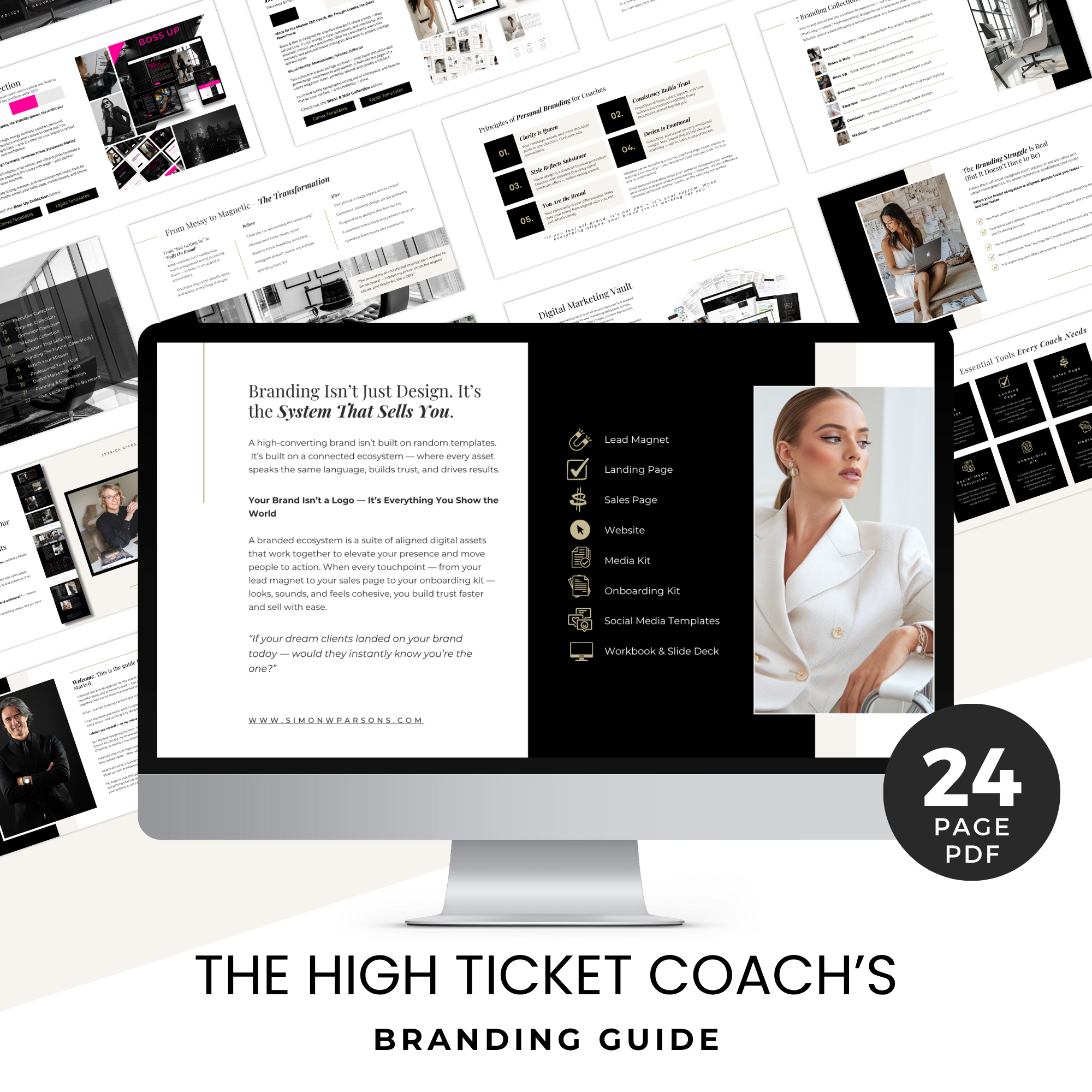
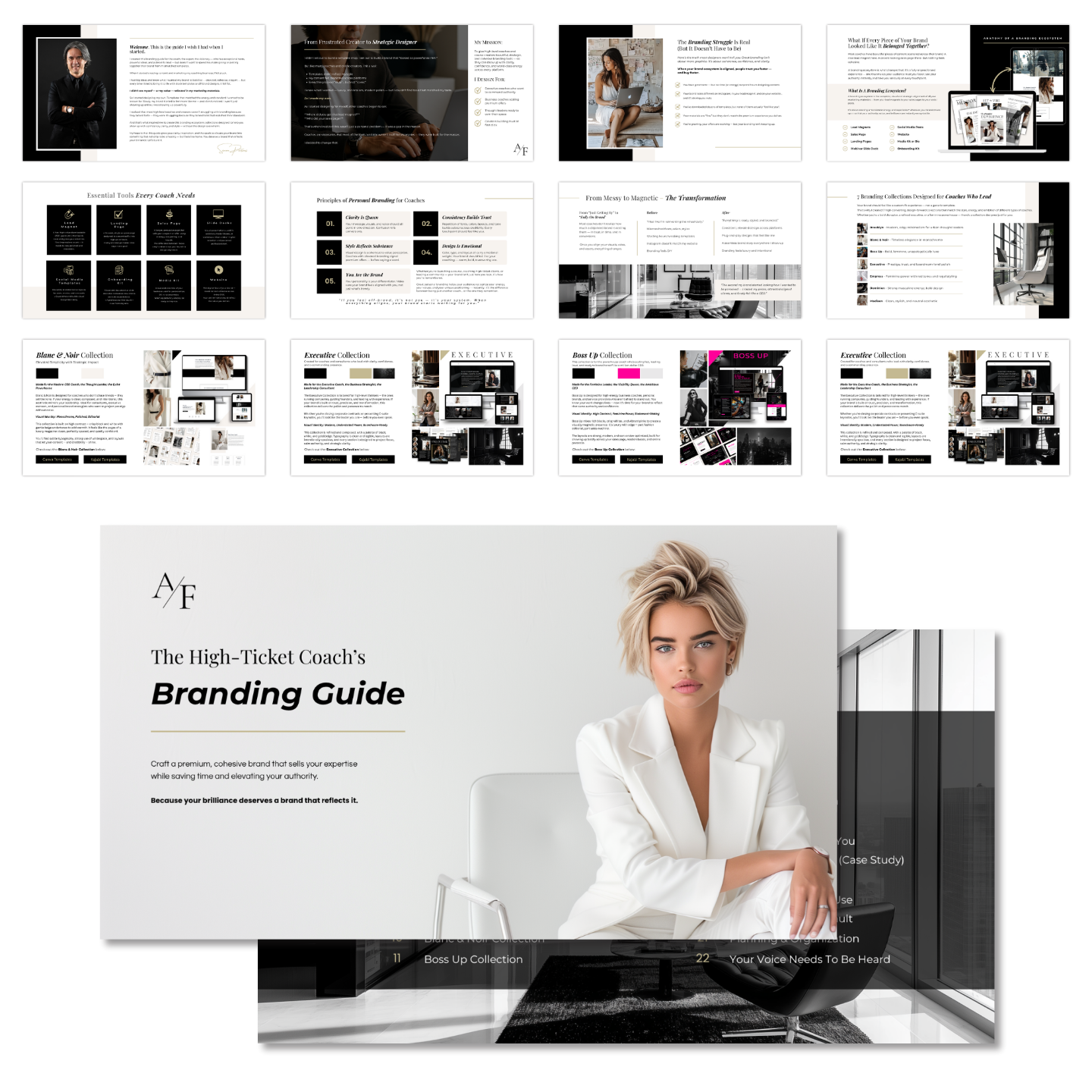
Grab my free High Ticket Coach Branding Guide
A free guide for coaches, consultants, and creators who are ready to ditch the DIY look and step into a cohesive, premium brand presence that sells.
We hate SPAM. We will never sell your information, for any reason.