Kajabi Landing Page Examples for Coaches (Real Types That Convert)
Apr 09, 2026
If you've been Googling "Kajabi landing page examples," you're probably trying to figure out what's actually possible inside the platform before you build something yourself. Good instinct.
Kajabi can produce beautiful, high-converting landing pages. It can also produce forgettable ones. The difference isn't the platform. It's the design decisions behind the page.
This article walks through the main types of landing pages coaches build in Kajabi, what each one needs to work, and what they can look like at a premium level.
What Is a Landing Page in Kajabi (and Why It's Different From Your Website)
Your website is a destination. A landing page is a decision point.
When someone lands on a Kajabi landing page, they're there for one reason: to say yes or no to a single offer. There's no navigation menu pulling them away. No blog sidebar. No "about" link to click when they get distracted. Just the offer, the information they need to make a decision, and a button.
In Kajabi, you can build landing pages inside the website builder using their standard page layouts, or through the pipeline and product sections depending on what you're creating. The design flexibility is real, especially if you start with a well-built template rather than a blank canvas.
The types of pages below each serve a different conversion goal. Most coaching businesses need at least three or four of them.
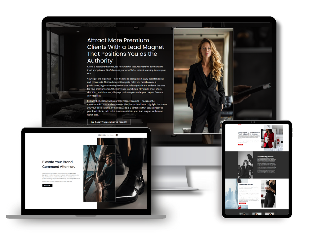
Sales Pages: The Landing Page That Does the Heavy Lifting

A sales page is where your signature offer lives. This is the page you send warm leads to. The one you link to in emails. The one that has to do a lot of work without you being in the room.
The image above is an example of my Milano Sales Page Kajabi Template.
For high-ticket coaches, a strong Kajabi sales page typically includes:
A headline that speaks directly to the outcome the client wants (not what the program is called). A section that describes who this is for in specific, recognizable terms. A breakdown of what's included, written in plain language. Social proof that addresses the exact doubts your reader has. A clear price point or invitation to apply. A CTA repeated throughout, not just at the bottom.
The visual design matters here more than most coaches realize. White space, font hierarchy, a clean layout, and professional imagery can be the difference between a page that reads like a premium offer and one that doesn't inspire confidence, regardless of the price you're charging.
A well-designed Kajabi sales page template takes care of the layout and hierarchy for you. You fill in your copy, your photos, your color palette, and the bones are already in the right place.
Opt-In Pages: Your Lead Magnet's Front Door
An opt-in page has one job: get the email address.
These pages are typically short. A strong headline. A sentence or two about what they're getting and why it's worth their inbox. An email capture form. Done.
The trap coaches fall into is overcomplicating this page. Long copy, too many bullet points, a full brand story. None of that is needed here. The person who lands on your opt-in page is already interested. Your job is to not talk them out of it.
In terms of design, opt-in pages should feel consistent with the rest of your brand. If your main website is clean and minimal, your opt-in page should be too. A jarring visual shift between your website and your lead magnet page creates friction, and friction costs you conversions.
Kajabi handles opt-in forms natively, so everything integrates with your email automations without any third-party connection required.
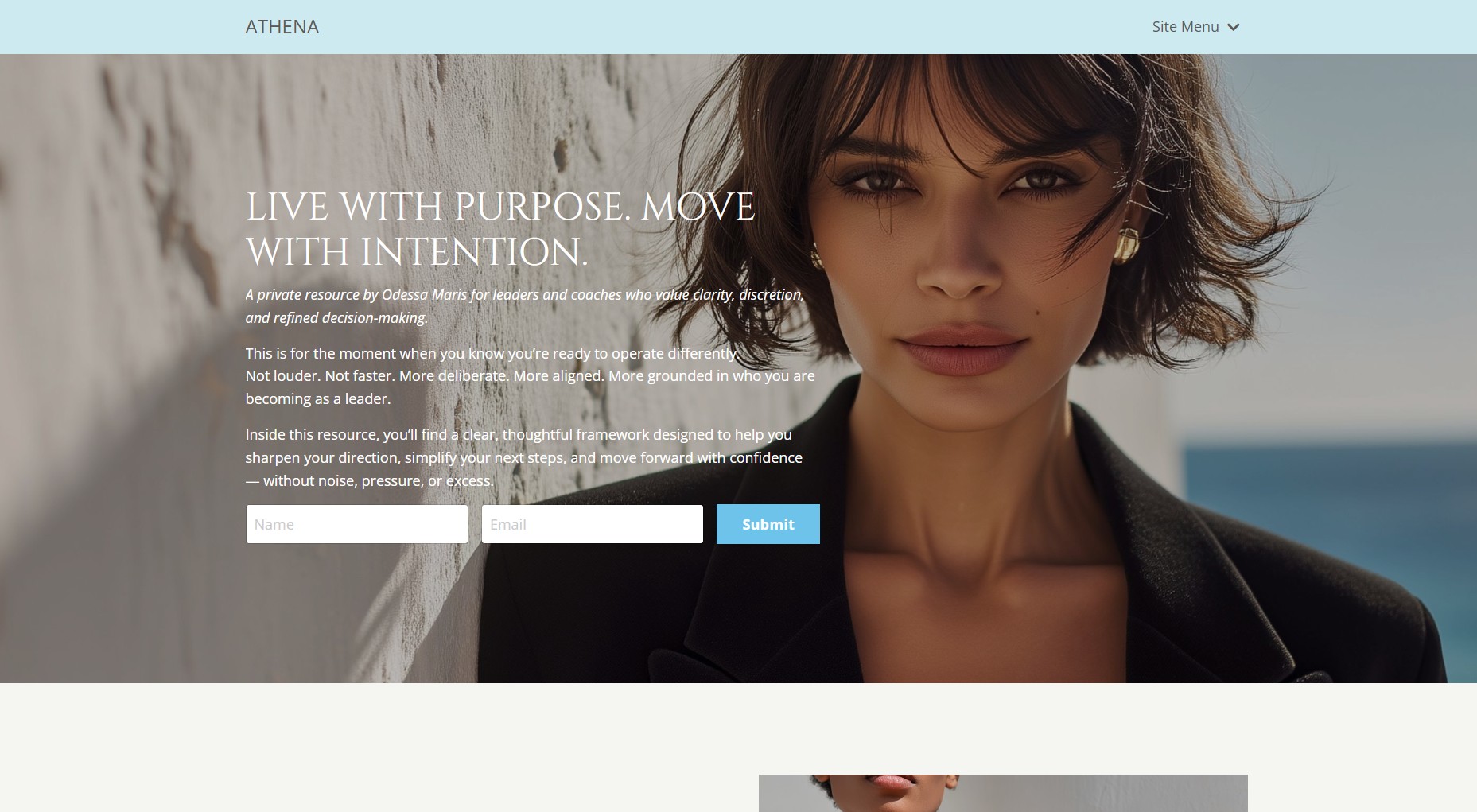
Above is a screen shot of my Athena Lead Magnet Opt In Page Kajabi Template, you can see where there is a simple form to collect a name and email.
Webinar and Workshop Registration Pages
If you run live workshops, masterclasses, or webinars as part of your client acquisition, you need a registration page that creates urgency without feeling pushy.
These pages have a short shelf life, which is all the more reason to make them fast to build. A great Kajabi template means you're not starting from scratch every time you run an event. You update the title, the date, the image, the copy, publish, and go.
The key elements on a registration page: what they'll learn or experience, when it is, why you're the right person to deliver it, and a prominent register button. That's it. Keep it tight.
Discovery Call Booking Pages
Not every Kajabi landing page is tied to a purchase. For coaches who sell high-ticket 1:1 work, the conversion goal is often a call booking, not a transaction.
A discovery call page bridges the gap between a cold or warm prospect and a sales conversation. It should explain what the call is, who it's for, what they can expect to talk about, and give clear instructions on how to book.
These pages pair well with an embedded scheduler (Calendly, Acuity, or Kajabi's own scheduling if you use it). The design should feel warm and personal rather than corporate. If your whole brand is premium and visual, your booking page should match that standard.
A low-effort booking page embedded in an otherwise polished Kajabi website sends a mixed message to prospective clients. The detail matters all the way through.
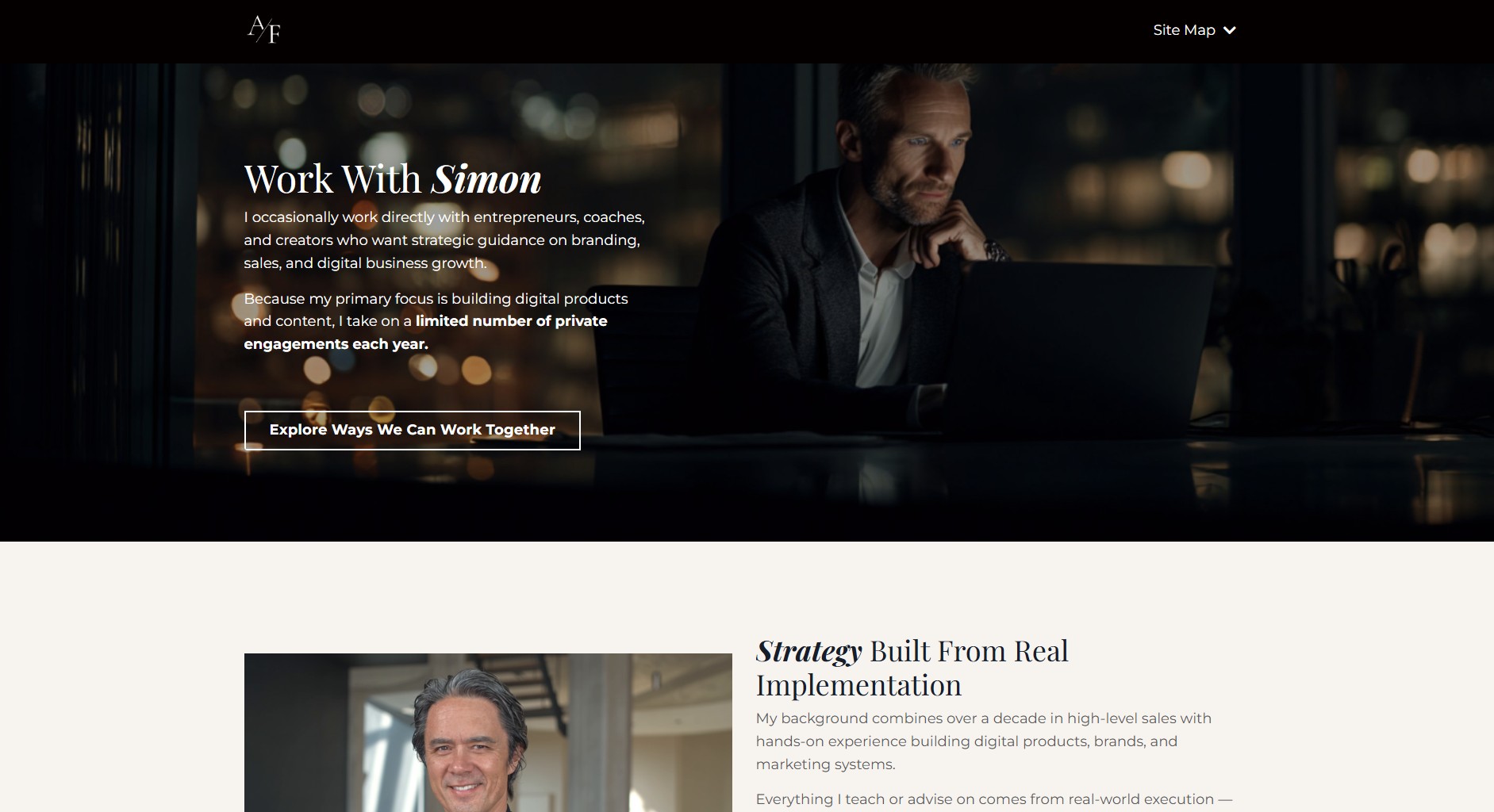
Above is a screenshot of my booking page for my consulting services. On this type of a landing page you can use a contact form or link to a calendar page to schedule a discovery call.
Mini-Course or Free Training Pages
Offering a free mini-course or video series is a strong lead generation strategy for coaches. Kajabi is well suited for this because you can host the content inside Kajabi products and deliver it automatically when someone opts in.
The landing page for a free course or training is a hybrid between an opt-in page and a sales page. It needs enough information to make the value clear, but not so much that it overwhelms someone who's just looking for a quick free resource.
Think of it like this: the page needs to answer "what do I get, and why do I want it?" quickly. If a reader has to scroll significantly to find those answers, you've lost them.
These pages also benefit from a clear visual hierarchy. A strong hero section with a bold headline, an image or mockup of the course or training, a short bulleted breakdown of what's inside, and a single CTA.
What Separates a Good Kajabi Landing Page From a Great One
The mechanics of a landing page are learnable. The visual standard is where most coaches fall short.
A great Kajabi landing page looks intentional. Every section has a purpose. The fonts are consistent. The spacing is deliberate. The images are high quality and tonally aligned with the brand. The color palette is cohesive throughout.
When you look at a strong landing page, nothing feels off. The reader isn't consciously thinking "this looks professional," but she is forming an impression, and that impression shapes whether she trusts you with her money or her email address.
This is exactly why starting from a well-designed Kajabi template is worth it. Not because you can't build something from scratch, but because the design decisions have already been made at a high level. You're not choosing font pairings or figuring out section spacing. You're focused on your copy and your offer.
You Don't Have to Build These From Scratch
Every one of these landing page types can be built inside Kajabi. And every one of them is easier to build when you start with a template designed specifically for high-ticket coaches.
The Kajabi templates in my shop are built with this in mind. Clean layouts, premium design, and a structure that makes the copy work harder. If you want your landing pages to look as good as the offer behind them, that's where to start.
If you're specifically looking for sales page templates, the Kajabi sales page templates are designed to convert. And if you want the full website plus landing pages in one cohesive aesthetic, take a look at the Kajabi website templates collection.
Your next client is going to land on one of these pages before she ever speaks to you. Make sure it earns her trust.
In my next article I will compare Kajabi vs. Wordpress for coaches.
Simon
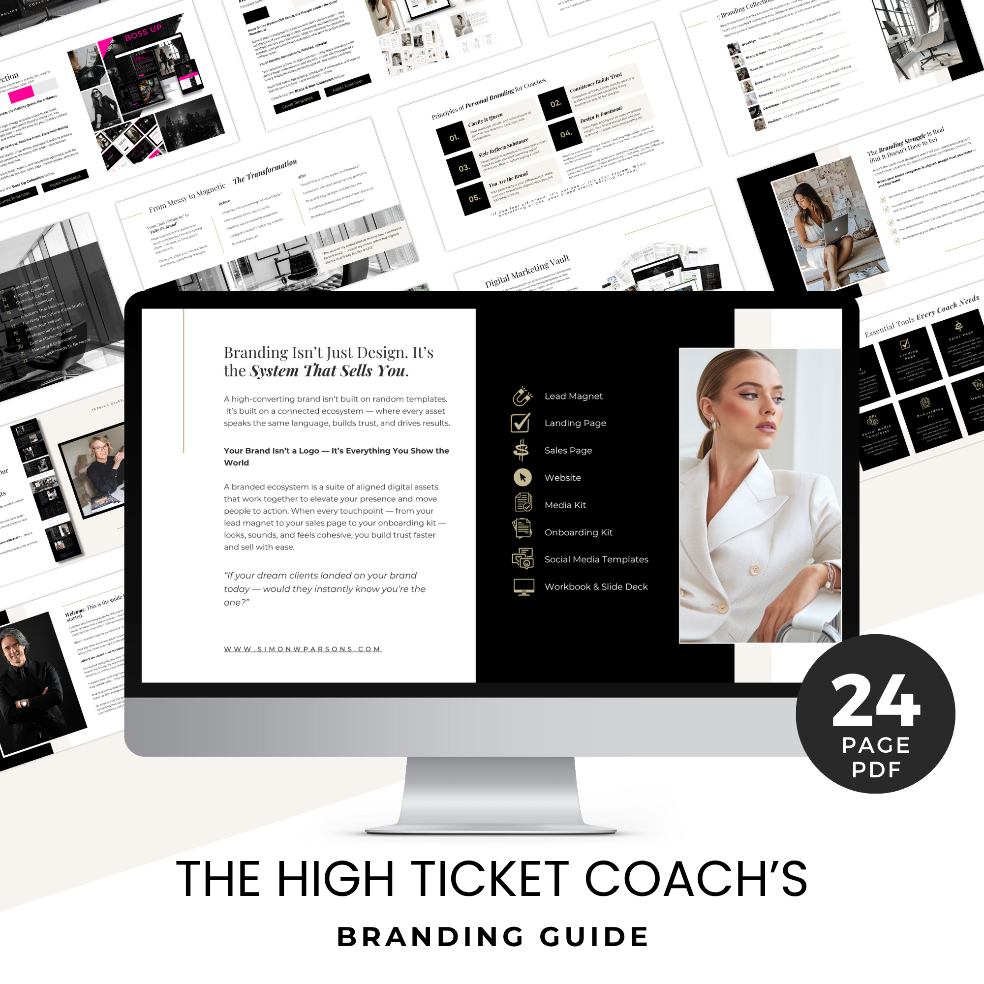
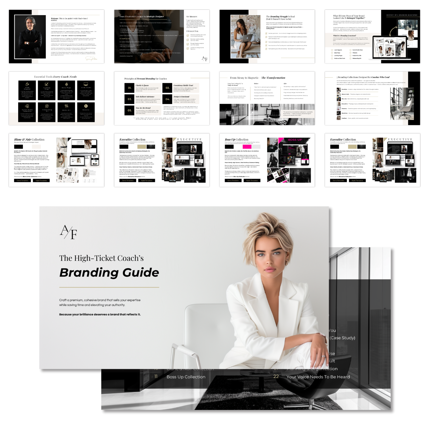
Grab my free High Ticket Coach Branding Guide
A free guide for coaches, consultants, and creators who are ready to ditch the DIY look and step into a cohesive, premium brand presence that sells.
We hate SPAM. We will never sell your information, for any reason.