The Sales Page Structure Behind Every High-Converting Kajabi Template I Build
Sep 06, 2026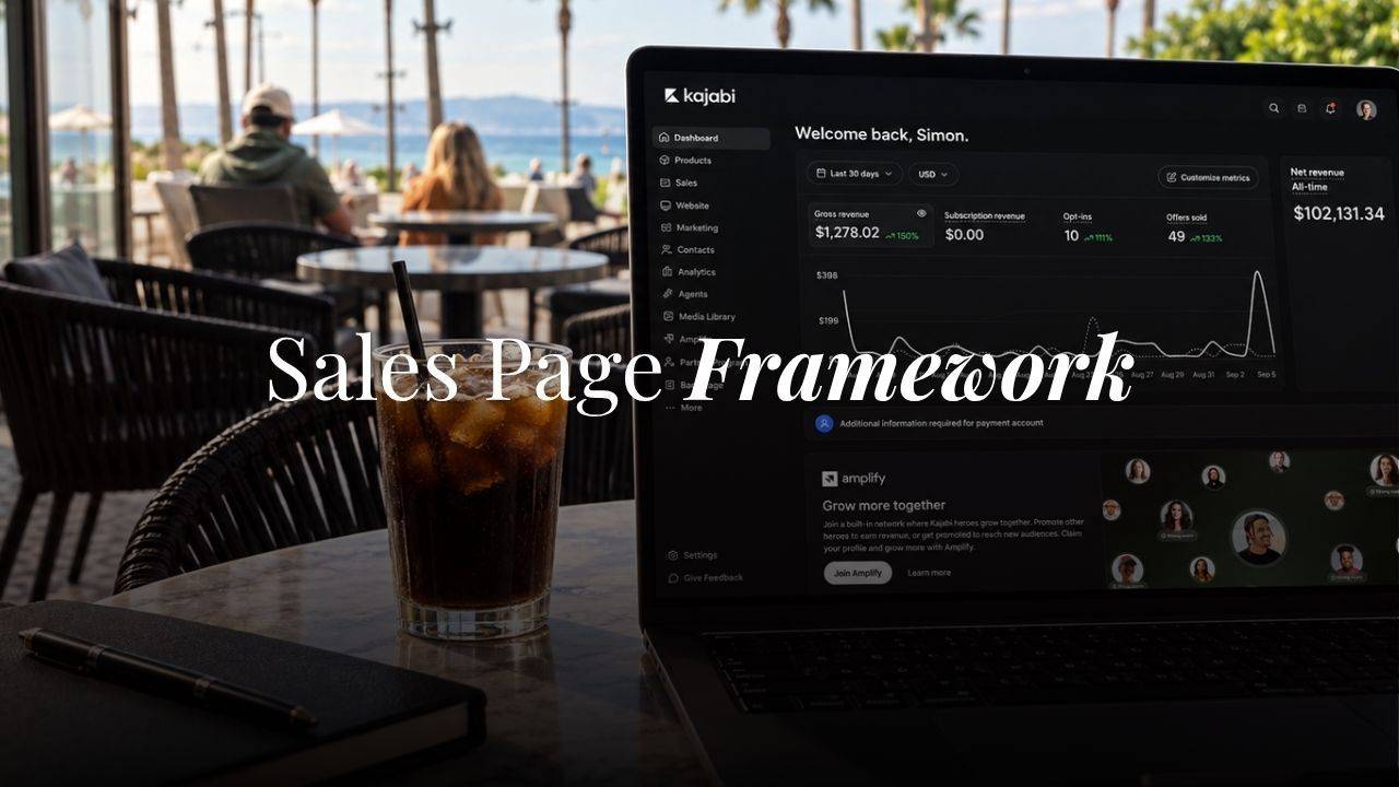
The first sales page I ever built inside Kajabi took me most of an afternoon and converted at under one percent. I'd picked a stock section, dropped in some product copy, added a buy button, and called it done.
It wasn't the design that was the problem. It was that I had no structure behind it. Just a page with words on it, hoping to sell something.
A sales page is how you sell an offer on your own website, and Kajabi gives you two starting points: a stock template that rarely matches your brand, or a blank page and a blinking cursor. Neither one hands you a framework. That's the part most people skip past.
Why Most Kajabi Sales Page Templates Don't Convert
Open the template library inside Kajabi and you'll find plenty of pretty sections. A hero block here, a pricing card there, a testimonial carousel you can drag in wherever you want.
What you won't find is the order those sections need to go in, or the psychology that should drive each one. So people build pages the way I did that first time, dragging in whatever section looks good and hoping the words underneath it do the selling.
I spent years studying how the best sales pages in digital marketing actually work before I landed on my own version. Russell Brunson's pages move a buyer from emotion to logic and close hard with scarcity, though a lot of them lean loud and salesy in a way that's rarely fit my brand. Amy Porterfield's pages feel warmer and more like a conversation, built for selling a course after a webinar rather than cold traffic.
I took the psychology from one and the tone from the other, and built a structure that's sold six figures in digital products directly off my own website. Every Kajabi sales page template I design now starts from this same 10-section framework.
There's a Kajabi-specific wrinkle worth knowing before you build any of this. Kajabi auto-generates a sitemap for your website pages, but custom sales pages and product pages don't always get swept into that automatically.
If you're building a standalone sales page outside your main site navigation, check that it's actually indexable, and link to it from a blog post or another page on your site rather than letting it sit orphaned. That internal link is doing SEO work Kajabi's sitemap can't do on its own.
The Framework, Section by Section
This structure works for a digital product, a course, or a coaching offer, with a couple of small adjustments I'll flag as we go. Here's the order, and what each section needs to do.
In this example, I'll use the Obsidian Sales Page Template and Athena Sales Page Template as an example and use some screen shots, keep in mind this is a template so I'm using placeholder text but it will give you a visual of how I lay out these sections.
Section 1: The Hero
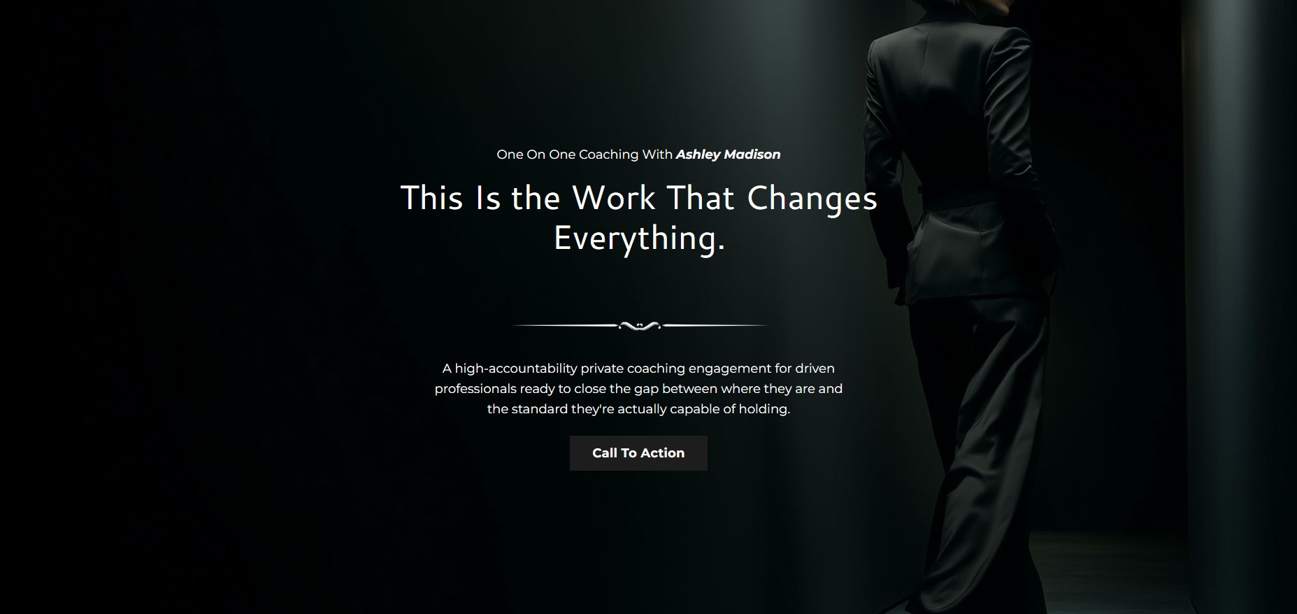
Your hero section carries the offer's mockup or a background image that signals what the page is about, paired with a bold, outcome-based headline. Not a features headline. An outcome one. "Wake up to sales you made while you were sleeping" sells a feeling. "Digital product template with 12 sections" sells a spec sheet.
This is also where your keyword belongs, in the actual headline text, because that headline is your H1. One important Kajabi quirk here: hero sections can accidentally create a second H1 on the page if you're not careful with how the section is built. Check this before you publish. One H1 per page, every other heading on the page as an H2 or H3.
Below the headline, one to three sentences telling the visitor exactly what this is. That's the whole section. Resist the urge to explain more.
Keep the hero image light too. A heavy background video or an oversized image file will slow down your load time, and a slow-loading sales page bleeds visitors before they ever read your headline. Compress it first.
Section 2: The Problem

Now name the problem your offer solves, using language your reader already uses about herself. Not the problem you think she has. The one she'd type into Google at 11pm.
A personal story works well here if it's specific. Not "I struggled with this too," but the actual moment. I was sitting in my truck outside a client meeting when I realized I'd said yes to six months of work I didn't even want, that kind of specific. Vague struggle reads as filler. A real moment reads as someone who's been where she is.
Section 3: The Solution
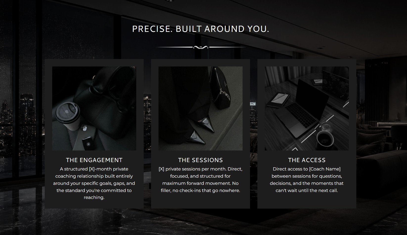
Introduce your offer as the answer to the problem you just named, without listing every feature yet. Save the spec sheet for section 4. Right now you're still working in emotion.
A short story of how you found or built this solution fits naturally here, along with a loose picture of what the transformation looks like. A simple three or four step overview helps her connect the dots between where she is and where this offer takes her.
I use this section on my own Kajabi sales pages to talk about how most people are using a tool like Kajabi at maybe a third of its capacity, running a business on features they've barely touched. The solution isn't "buy this template." It's "here's what your site could actually be doing for you." The product comes in right after that.
Section 4: The Offer Breakdown
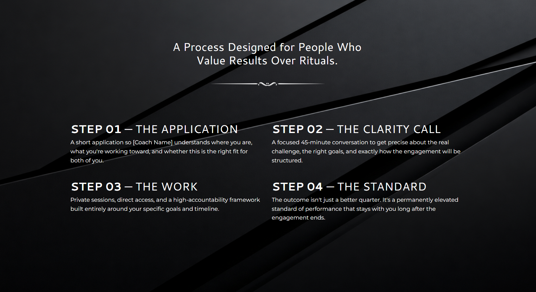
Now get specific. For a template, that means a section-by-section breakdown of what's inside. A course calls for a walk-through of the modules instead, and coaching usually reads better as a rundown of what happens in each session.
Clear beats exhaustive. List what's included, keep the descriptions short, and move on. This section exists to answer "what do I actually get," not to re-sell the whole offer again.
For my own Kajabi templates, this is where I break down the actual pages included (home, sales page, checkout, thank you page), what's pre-built into each one, and what she'll need to customize versus what's ready to publish as-is. Specificity here builds trust in a way a vague "everything you need" bullet just doesn't.
Section 5: Who This Is For

This section isn't a list of every job title who might buy. It's a specific picture of who this reader is becoming.
I'm writing this for one person: the high-ticket coach who wants her Kajabi site to look as premium as the results she gets her clients, not a template that makes her look like every other shop on Etsy. If that's not who's reading, that's fine. This section exists to filter for the right reader, not to flatter every possible one.
A disqualifier can sharpen this further. Something like "this isn't for someone who wants to keep using the default Kajabi theme and hope it converts." Naming who this isn't for makes the invitation to who it is for land harder.
I'd rather pick that one reader and write directly to her than try to stretch this section wide enough to fit a handful of different businesses. The narrower version is the one that actually lands.
Section 6: The Transformation
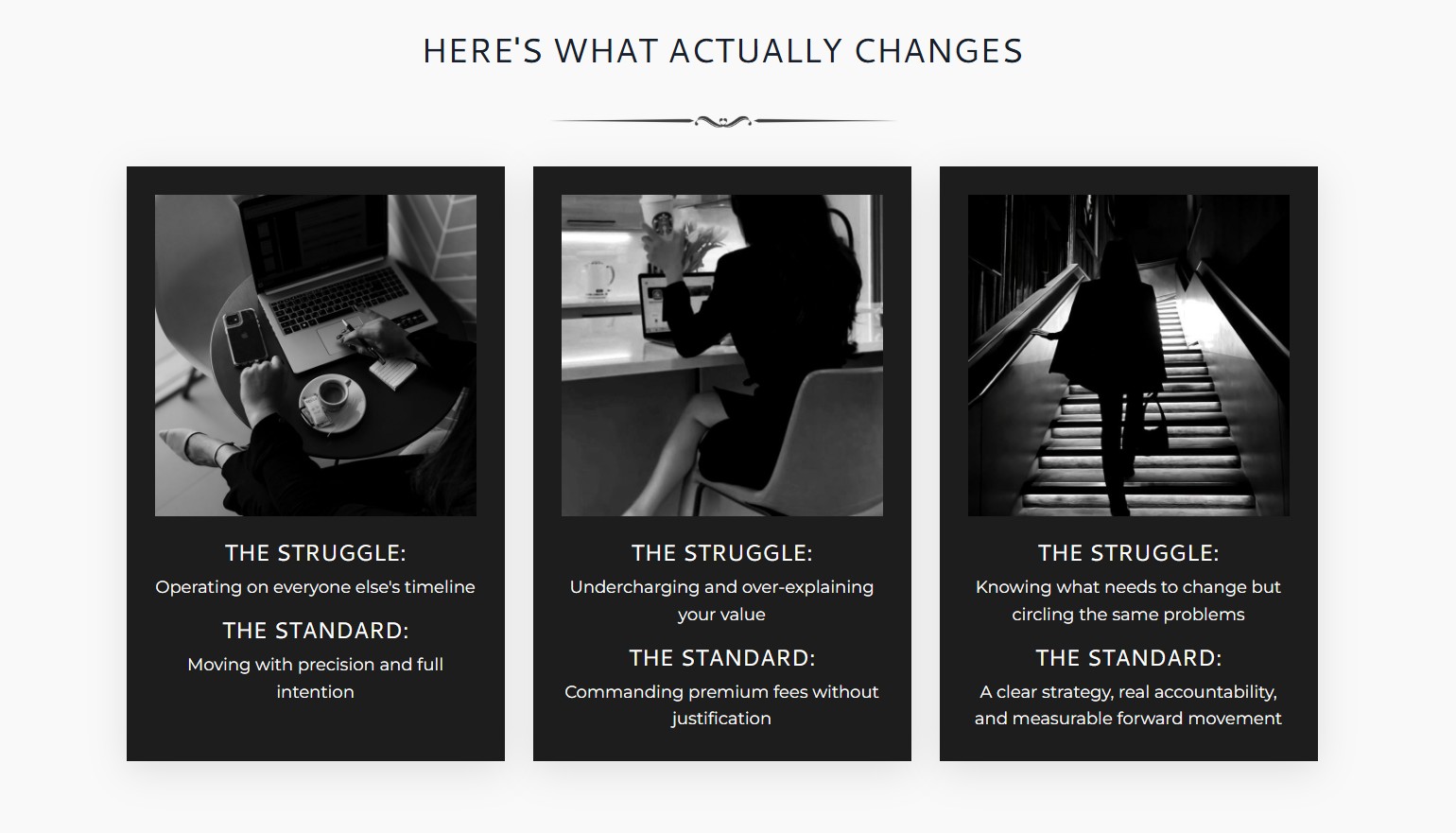
Describe how it feels once she's on the other side of this purchase. Not the feature she bought. The feeling of having it.
Waking up to Kajabi checkout notifications instead of wondering if anyone's buying. Opening her site and feeling proud to send a client to it instead of hoping they don't notice the mismatched fonts. This section runs on emotion, so let it.
Section 7: Social Proof
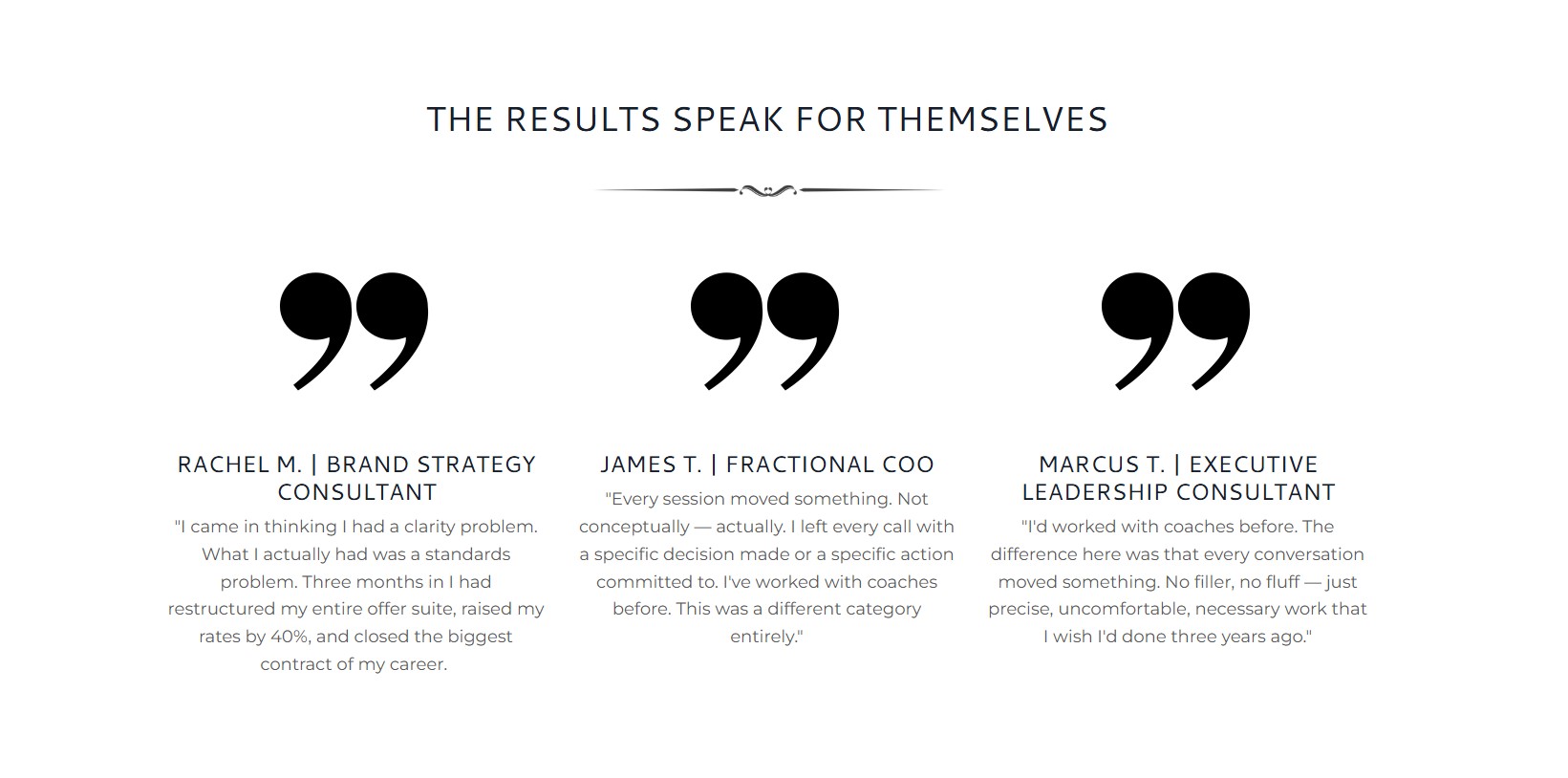
Back up everything above with proof, and stack more than one kind if you have it. Client results, reviews, your own track record, a specific before-and-after.
I lead mine with numbers I can stand behind: 11x President's Club in enterprise sales before I ever sold a template, over 4,000 completed Etsy sales, and a top-three ranking among template sellers on the Kajabi Marketplace. I also keep a running page of client reviews I can link to from any sales page I build, pulled from Etsy and LinkedIn recommendations. New offer, no reviews yet? That page still gives a visitor a reason to trust you.
That running reviews page is worth setting up even if you only have a handful of testimonials right now. Every time a client leaves a review anywhere, add it to that one page. Six months from now you'll have a resource you can link to from every sales page you ever build, instead of starting from zero on each new offer.
Section 8: The Pricing Card

Bring back a hero-style image of the offer, a short recap of what's included, and a clear buy button. If you're offering more than one option (a template alone versus a template with install support, say) this is where those live side by side.
Inside Kajabi, this is usually where your sales page hands off to your checkout page. Keep that handoff simple. A pricing card that's cluttered with five competing options usually converts worse than one clean option and a single upgrade.
This is also a good moment to check your checkout page matches the sales page it's coming from. A polished sales page that hands off to a generic default checkout undoes a lot of the trust you just built. They should feel like the same brand, the same page, just the next step.
Section 9: FAQ
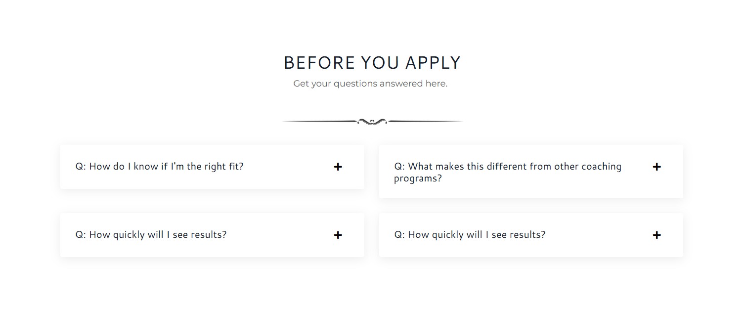
An FAQ section does two jobs at once. It answers the logistical questions (how do I install this template, what if it doesn't fit my brand colors) so you're not fielding them by email. And it lets you address the real objection sitting under those questions, the one about whether this will actually work for her.
Write your FAQ from the objections you already hear, not the ones you assume exist. For a Kajabi template, that usually means questions like "do I need any design experience to customize this," "will this work with the Kajabi plan I'm already on," and "what happens if I get stuck installing it." Answer each one directly, and link to a help resource if you have one instead of leaving her to figure it out alone.
Section 10: The Final CTA
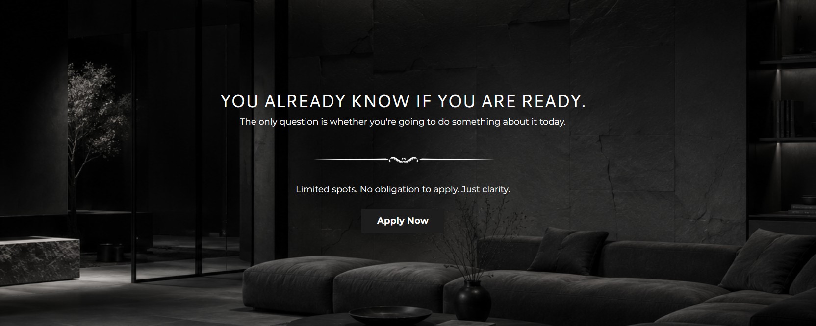
Close the page. Short, confident, and pointed straight at the buy button. This isn't the place for a new argument. It's the place to ask for the sale one more time, clearly.
When You're Selling Something Higher-Ticket
This exact structure works for coaching and courses too, with a few additions worth considering if your offer sits above a few hundred dollars.
Bonuses add perceived value without costing you anything extra to deliver, since they're digital. A countdown or a genuinely limited number of spots creates a real reason to buy now instead of "someday." Contrast pricing works well too: showing a base option next to a second option with a stack of bonuses at a higher price makes the mid-tier option feel like the obvious choice.
And if you're selling anything over a thousand dollars, don't expect the page alone to close it. Plan for a strategy call to do the closing your sales page started. The page's job at that price point is to get her to book the call, not to complete the sale on its own.
Why I Build Every Template Around This Structure
Every Kajabi sales page template in my shop is built on this sales page framework, the same one that's sold six figures in digital products off my own site. You're not getting a stock layout with sections in a random order. You're getting the structure that's already been tested against real buyers, wrapped in the aesthetic design most Kajabi themes tend to miss.
Design still matters, of course. A perfectly structured page in the wrong fonts and mismatched colors still won't make a high-ticket coach feel like her brand belongs on it. That's the layer most template shops skip entirely, building pages that follow a decent structure but look like every other Kajabi site in her niche. I build both into every template: the psychology that gets the page to convert, and the aesthetic that makes it look like it was designed just for her.
If you've been piecing together sections and hoping something converts, that's the gap this closes. Take a look at the Kajabi Sales Page Templates and see which one fits the offer you're building next.
Grab my free High Ticket Coach Branding Guide
A free guide for coaches, consultants, and creators who are ready to ditch the DIY look and step into a cohesive, premium brand presence that sells.
We hate SPAM. We will never sell your information, for any reason.