Kajabi’s New Checkout Pages vs. Full Sales Pages — What I Actually Recommend (and Why)
Nov 27, 2025
If you haven’t logged into Kajabi recently… surprise.
The checkout pages got a major glow-up.
And honestly? They look really good.
Clean, modern, customizable, and way more flexible than the old versions we’ve all been hacking together for years. You can now edit sections, add headers, tweak layouts, and build out a checkout experience that actually feels like a true extension of your brand. It’s no longer just a boring little form asking people for their credit card.
For simple offers, it’s awesome.
But here’s the thing…
As much as I appreciate the upgrade, and as much as I love simplicity, I still prefer using a full sales page for most of my offers.
Let me explain—because this is where strategy actually matters.
Why the New Kajabi Checkout Pages Are a Big Deal
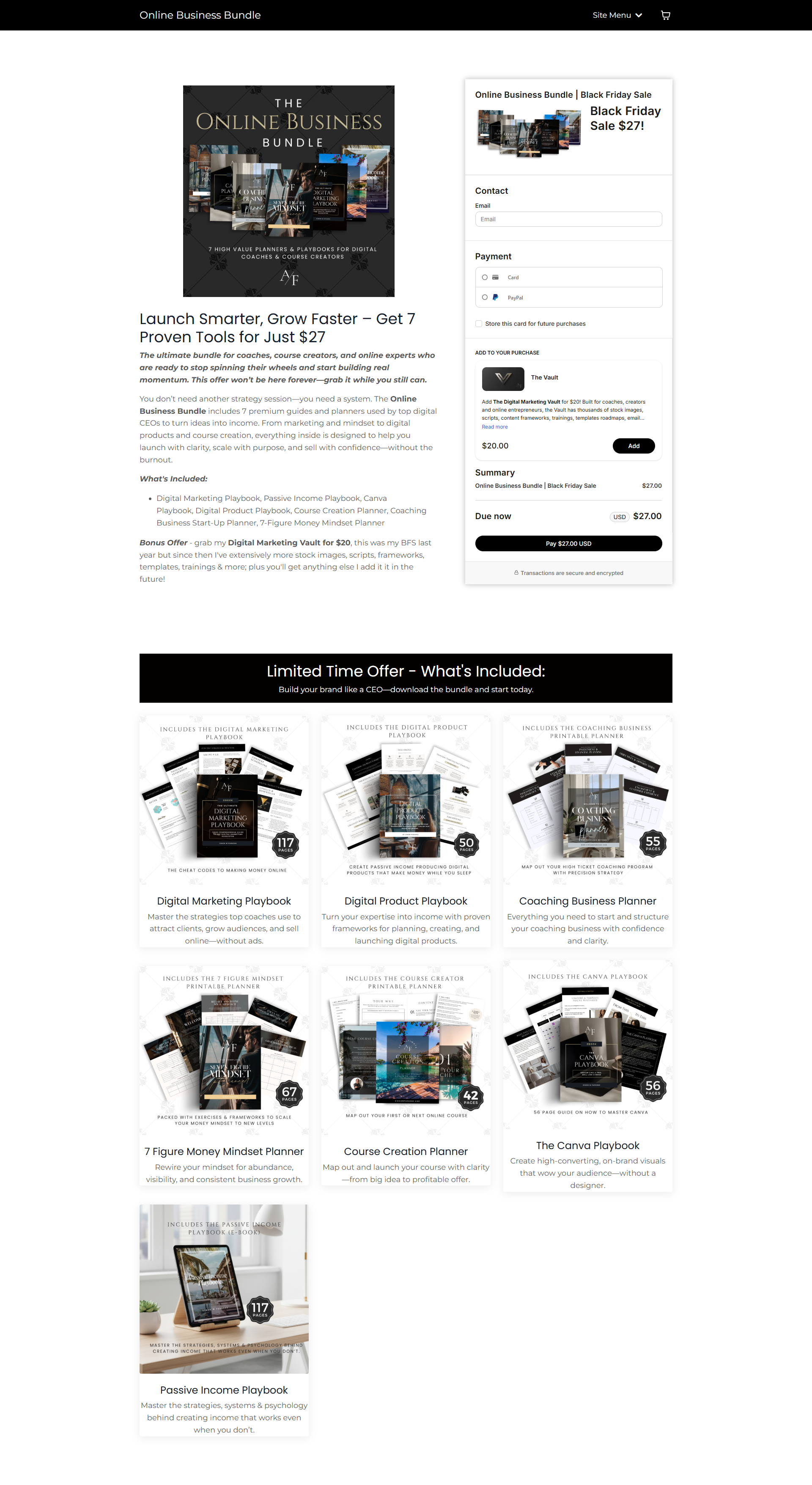
Photo above: I used an updated checkout page for a Black Friday Sale. Easy to put together and the new features allowed me to add feature cards to show more of what's included without creating a time intensive sales page.
Kajabi finally realized that creators want checkout pages that aren’t stuck in 2016.
The newest version gives you:
-
More customizable sections
-
Branded headers + images
-
Cleaner visual structure
-
Space for benefits, features, and short copy
-
A layout that doesn’t immediately scream “template”
-
A much better mobile experience
For low-ticket or straightforward offers, this is perfect.
If you’re selling something for $7, $19, $27… you don’t really need to take someone on an emotional journey. You just need a clean page, a clear promise, and a simple checkout.
And now you can do that inside Kajabi without building a full sales page from scratch. Huge win.
But here’s where the difference kicks in.
Why I Still Prefer Using a Full Sales Page for Most Offers
Sales pages let you do something checkout pages simply can’t:
Tell the story.
The emotional arc, the logic, the objections, the transformation, the testimonials, the social proof… all the things that actually move someone from “hmm maybe” to “take my money.”
You can’t replicate that depth on a checkout page—not even the new pretty ones.
Sales pages give you room to:
-
Speak to identity
-
Build desire
-
Use storytelling intentionally
-
Hit emotional and psychological triggers
-
Layer logic on top of emotion
-
Showcase testimonials in different formats
-
Include multiple pricing tiers
-
Compare options
-
Offer bonuses strategically
-
Warm up cold buyers naturally
And when you pair a full sales page with a pop-up checkout, you get the best of both worlds:
➡️ A beautiful, persuasive sales experience
➡️ A clean, frictionless checkout process
This combo is especially powerful for:
-
High-ticket offers
-
Coaching programs
-
Courses with multiple pricing tiers
-
Bundles
-
Anything that requires trust, context, or clarity
A sales page simply has more “depth per scroll.”
And depth builds belief.
So When Should You Use the New Checkout Pages?
Use the new Kajabi checkout pages when:
-
Your offer is simple
-
Your product is low-ticket
-
You don’t need a long narrative
-
Your buyer is already warm
-
You want a minimalist checkout experience
These new pages are perfect for things like:
-
Low-ticket templates
-
PDF guides
-
Mini-courses
-
Simple digital downloads
-
Flash sales
-
Tripwires
Because in these cases, people don’t need a long pitch—they just need a clean, trustworthy place to pay.
And the updated Kajabi checkout pages finally give us that without needing a full sales funnel.
When You Should Still Use a Full Sales Page
Use a full sales page when:
-
Your offer is high-ticket
-
You want to stack bonuses
-
Your product requires explanation
-
Your audience needs warming up
-
You want multiple pricing cards
-
Storytelling matters
-
You want to highlight authority and social proof
If your offer is $97, $197, $497, $2K+…
People need reasons.
People need clarity.
People need belief.
A sales page is where all of that happens.
And the cool thing is:
Once the person is emotionally bought in, a clean pop-up checkout (built with Kajabi’s new layout) finishes the job.
That’s the aesthetic funnel I use and recommend:
Sales page → Pop-up checkout → Confirmation page → Delivery.
It’s smooth, it’s modern, and it converts.
**If You Want Stunning Sales Pages for Kajabi…
I Built Templates That Give You That “CEO Creator” Look Without the Overwhelm**
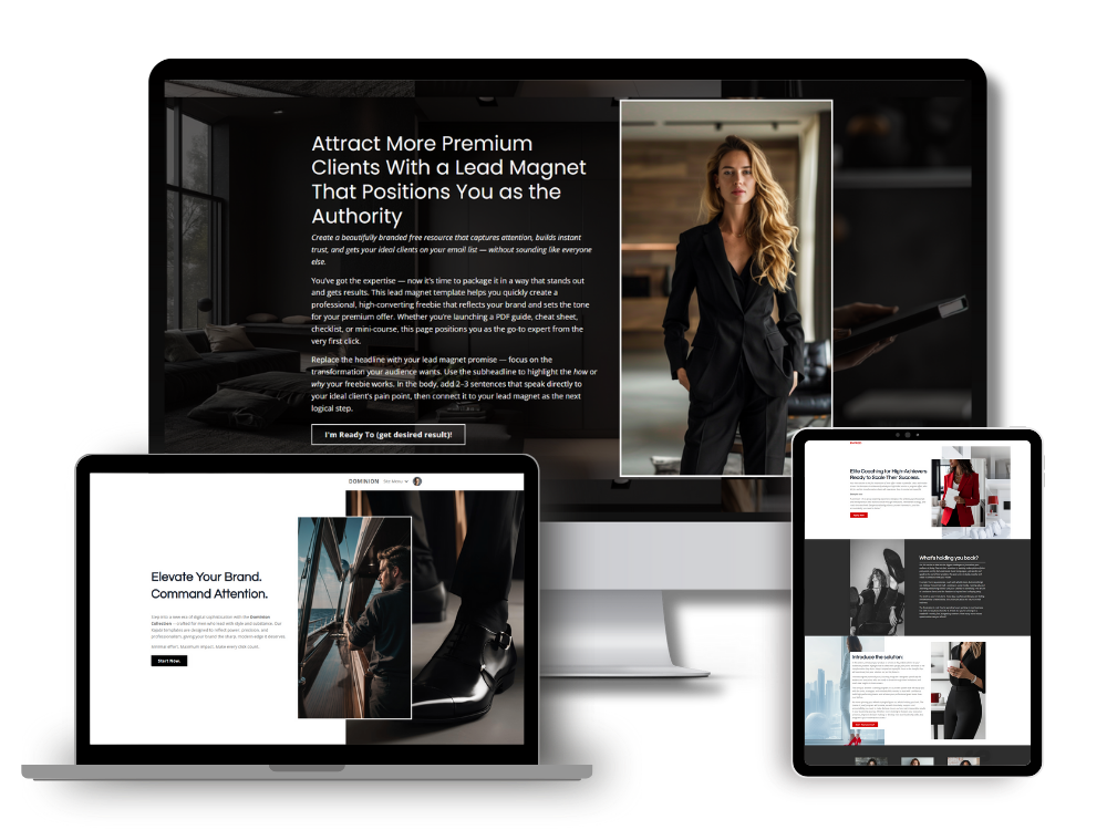
If you’ve been wanting to upgrade your Kajabi sales pages but the blank page keeps staring back at you… I get it. That’s why I created my collection of high-end Kajabi sales page templates.
They’re built for:
-
Coaches
-
Course creators
-
Digital product sellers
-
Anyone who wants to sell more without wrestling with design
They’re clean, persuasive, conversion-minded, and designed to layer perfectly with Kajabi’s new checkout pages.
➡️ Check out the Kajabi Sales Page Templates here
If you have questions about choosing between a checkout page or a full sales page for your offer, just reply back or shoot me a message. Happy to point you in the right direction.
You’ve got the product.
Let’s make sure the page that sells it is doing its job too.
— Simon
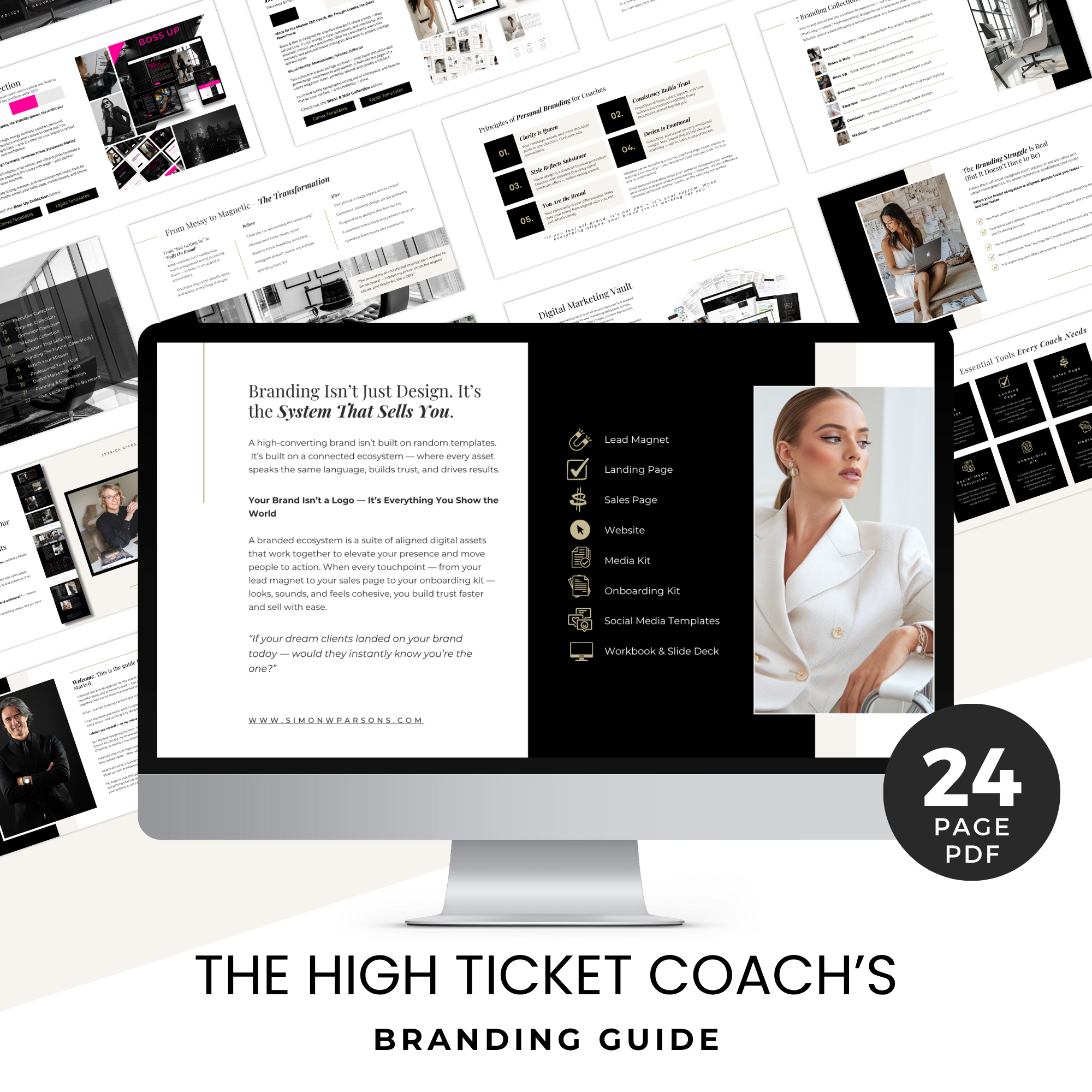
Grab my free High Ticket Coach Branding Guide
A free guide for coaches, consultants, and creators who are ready to ditch the DIY look and step into a cohesive, premium brand presence that sells.
We hate SPAM. We will never sell your information, for any reason.

