How Coaches Can Look Premium Online (Even Without Design Skills)
Apr 06, 2026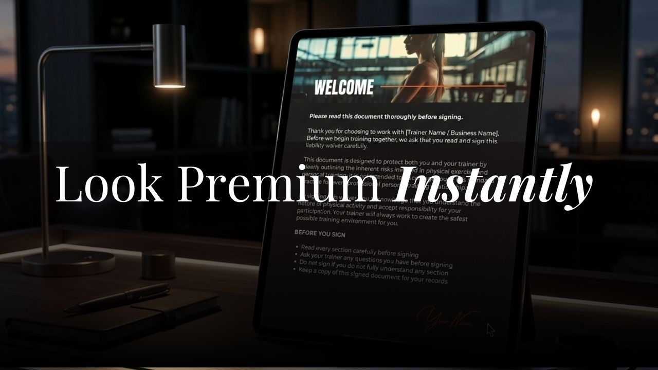
Your website is your storefront. Before a potential client reads a single word of your copy, she's already forming an opinion about you, your brand, and whether you're worth what you charge.
That opinion forms in seconds. And it's almost entirely visual.
The good news: looking premium online has nothing to do with being a designer. It has everything to do with making the right decisions upfront.
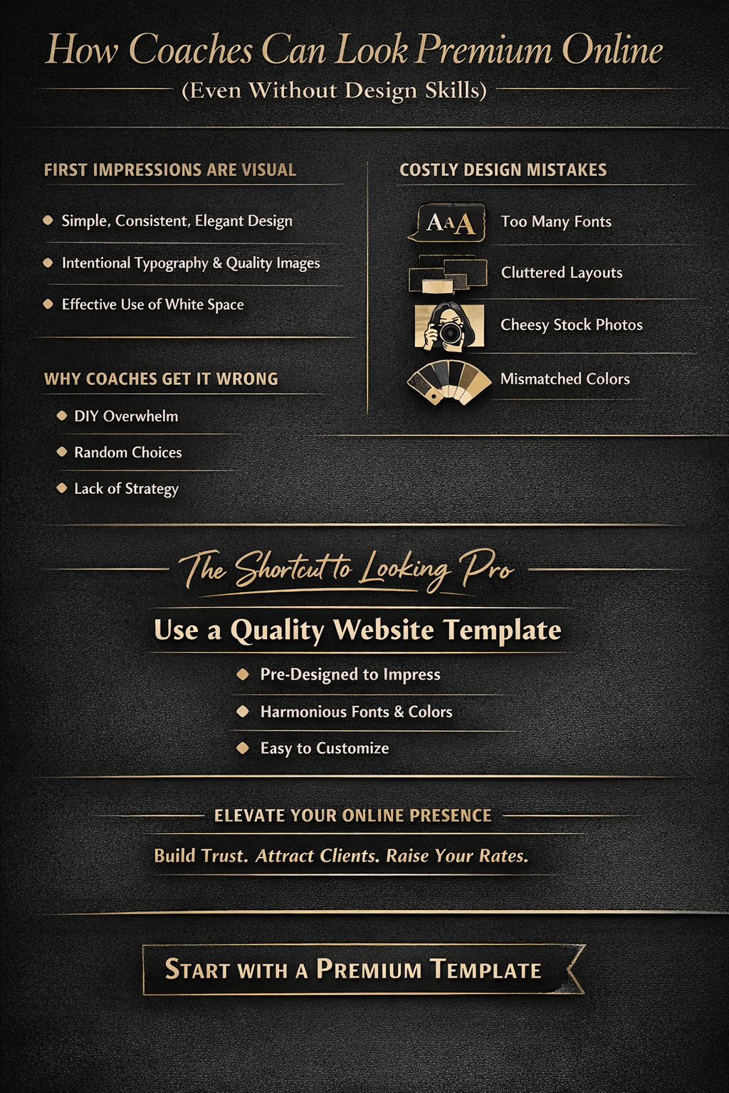
What "premium" actually looks like online
Premium is not about complexity. Some of the most high-converting coaching websites are remarkably simple.
What premium actually looks like is consistency. A clear color palette used throughout. Typography that feels intentional. Images that match the mood of the brand. White space used well enough that nothing feels cluttered or rushed.
When those elements work together, visitors feel it even if they can't name it. They trust you before they've read your bio.
When those elements are mismatched, visitors feel that too. They click away, often without knowing why.
The design mistakes that make coaches look cheap (even unintentionally)
Most coaches don't lose clients because their offer is wrong. They lose them because their website signals the wrong thing.
Here's what undercuts a premium positioning faster than almost anything else:
Using too many fonts. Two is enough. One for headings, one for body text. More than that and the page starts to feel chaotic.
Inconsistent spacing. When sections are crammed together, or margins jump around unpredictably, it creates a subliminal sense of disorganization.
Stock photos that look like stock photos. If the woman in your hero image is grinning at a laptop in a way no real human ever does, it reads as generic. Generic is the opposite of premium.
A color palette with no logic. Pulling in too many colous, or using clashing combinations, breaks the visual trust a premium brand needs to build.
These mistakes are common, and they're completely fixable, even if you have no design background at all.
Why most coaches struggle to pull this off on their own
Starting from scratch in Kajabi is hard. The platform gives you a blank canvas, which sounds like freedom but often produces overwhelm.
You pick a font you like. Then a color. Then another color. Then you look at the page and it doesn't quite work, but you don't know why, and you don't have the vocabulary to fix it.
This is where most coaches either spend weeks going round in circles, or pay a designer thousands of pounds for something they could have had faster.
There is a better way.
The shortcut that high-ticket coaches are using
A well-designed Kajabi template gives you something that's almost impossible to replicate starting from a blank page: a design system that already works.
The fonts have been chosen to complement each other. The color palette has been tested for visual harmony. The spacing, the section layouts, the hierarchy of text, all of it has been thought through. You're not making those decisions from scratch. You're slotting your content into a framework that already looks premium.
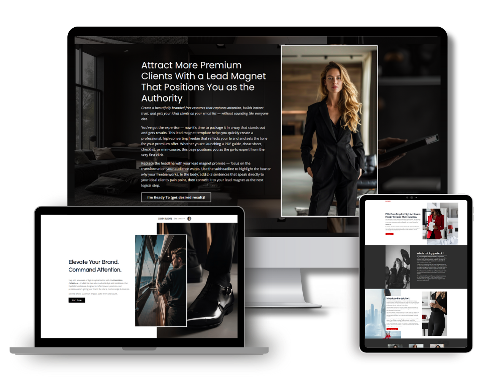
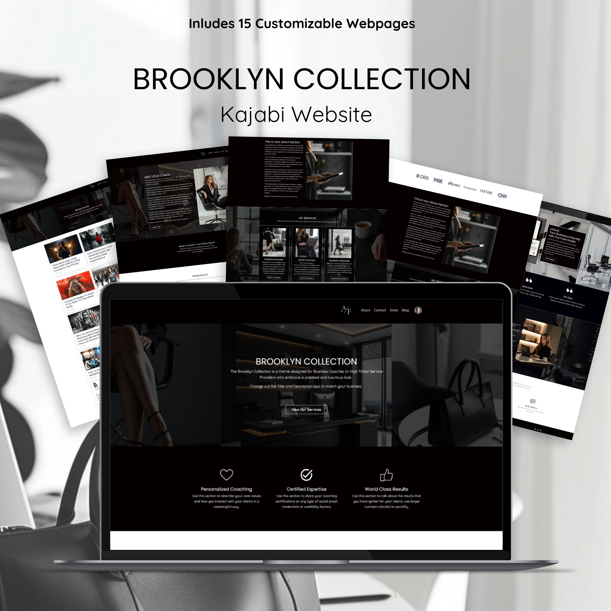
This is exactly why I built the Brooklyn Collection. It was designed for coaches who have a high-ticket offer and need their website to reflect that, without spending months or a fortune getting there.
What to look for in a Kajabi template if you want a premium result
Not all templates are built the same way. Here's what separates a premium Kajabi template from something that will limit you.
Look for templates with a clear design direction. Neutral palettes and editorial typography tend to age better than trendy color-heavy designs. If you want to be able to use the template for the next three years without it looking dated, restraint is your friend.
Check whether the template includes page types you actually need. A homepage is obvious. But what about your sales page, your checkout, your opt-in page? A template that covers the full journey gives you a cohesive look across every touchpoint.
Ask how customizable it is. A good template gives you a strong visual foundation and then gets out of your way. You should be able to update your brand colors and fonts without everything falling apart.
And look at the design through the lens of your client. Does it convey authority? Does it feel calm and trustworthy? Does it make you want to scroll?
If the answer to any of those is no, keep looking.
You don't need to be a designer. You need the right foundation.
The coaches I've watched build the most compelling online presences aren't the ones who know the most about design. They're the ones who started with a strong foundation and had the discipline to stay consistent with it.
That's what a premium Kajabi template gives you. A starting point that's already doing the heavy lifting, so you can focus on what you're actually good at: showing up for your clients and closing high-ticket work.
If you're ready to have a website that matches the quality of your offer, browse the full template collection here.
Simon
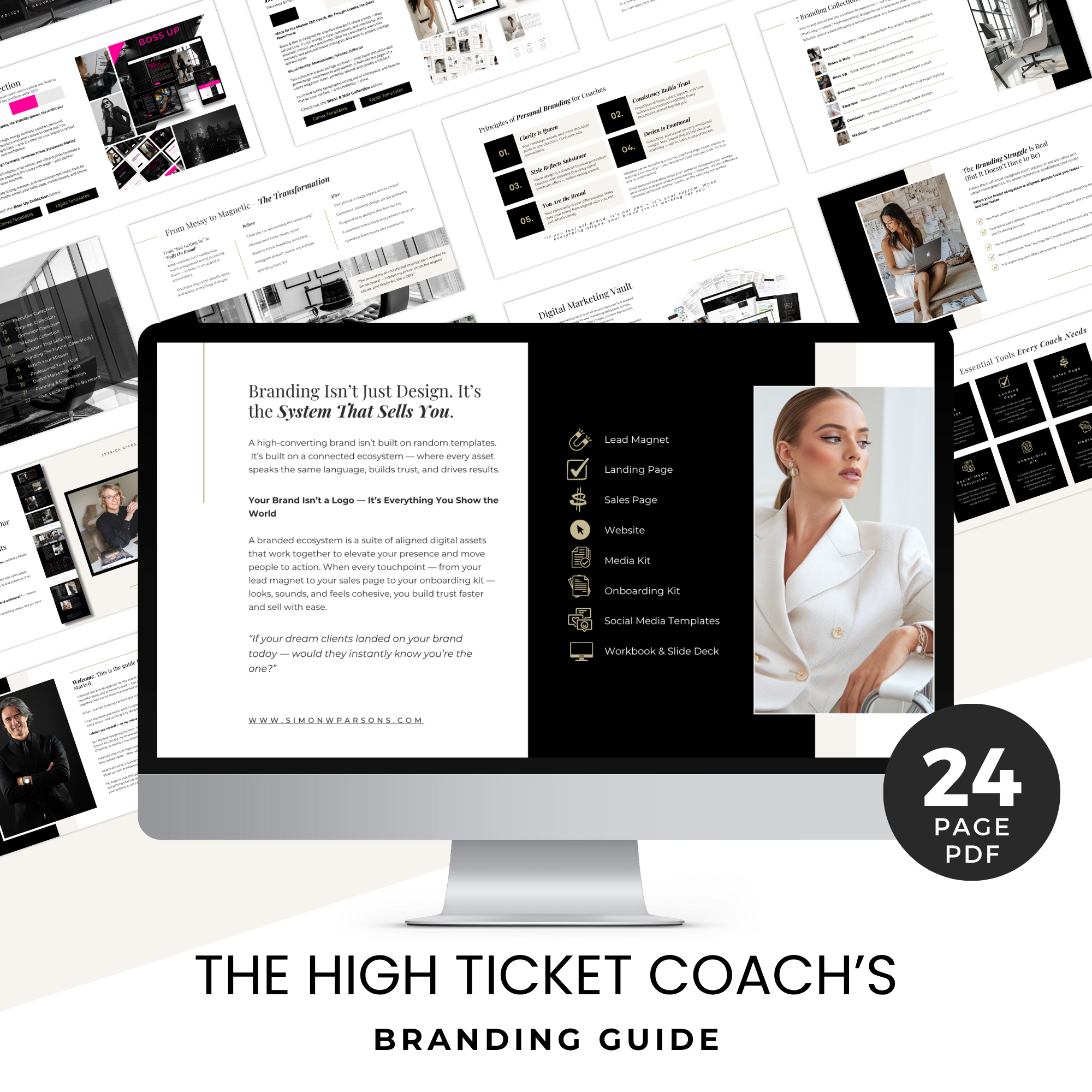
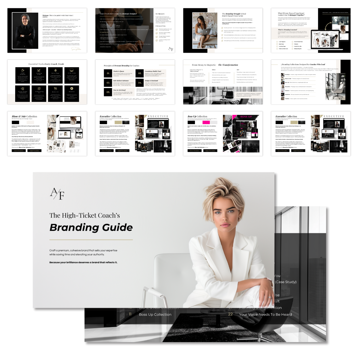
Grab my free High Ticket Coach Branding Guide
A free guide for coaches, consultants, and creators who are ready to ditch the DIY look and step into a cohesive, premium brand presence that sells.
We hate SPAM. We will never sell your information, for any reason.